
Everything You Need to Know About Color Grading in Photography
Everything You Need to Know About Color Grading in Photography
Create High-Quality Video - Wondershare Filmora
An easy and powerful YouTube video editor
Numerous video and audio effects to choose from
Detailed tutorials provided by the official channel
Have you recognized how flat your images look when you take them with your camera? While the scenery may be beautiful and your photography skills may be amazing, there’s always something missing. That “thing” is color grading, and that may be why your favorite superstar’s pictures appear better than yours. You can color grade your videos to produce the same effect too.
Color grading photography refers to a post-production process that improves your images by altering their color. The result of an excellent color grading process is an image that looks more appealing and refined. It’s what gives a picture some professional touch.
If you want to learn more about color grading photography, this article will let you in on all you need to know. From essential color grading steps to terms, tools, etc., you can begin your journey to cool and exciting images after reading.
In this article
01 Don’t Confuse Color Grading With Color Correction
03 Common Steps To Color Grade a Photo
04 Tips For Color Grading Photography
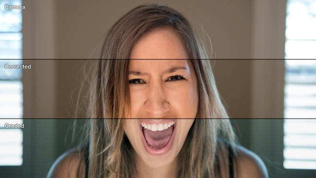
Don’t Confuse Color Grading With Color Correction
The first way to fully appreciate color grading is by differentiating it from its closest term—color correction. Many people use both of them interchangeably, and that’s wrong. Although color grading and color correction are post-production processes that enhance image colors, they perform different roles.
Here’s how to differentiate color grading from color correction:
| Differentiating Factor | Color Grading ; | Color Correction |
|---|---|---|
| Definition | Color grading is a process that enhances an image’s color by stylizing or giving it a cinematic appearance. | Color correction is a process that adjusts color mistakes in an image by giving it a consistent appearance. This process balances colors by adjusting whites and blacks. |
| Purpose | The primary aim of color grading an image is to evoke specific emotions in the viewers. Color grading leverages the emotional and psychological effects of colors to manipulate the viewers’ moods. You can use color grading to give your images different tones or themes like fear, femininity, youthfulness, passion, anger, sadness, etc. | Unlike color grading, the color correction does very little in setting the tone or mood that an image carries. Instead, it corrects specific mistakes in the image to make it look as natural to the human eyes as possible. Generally, camera lenses and the human eyes view pictures differently. Color correction changes a photo’s look to make it more appealing to humans than the camera. It makes black colors appear darker and adds more white to whites to create the desired effect. |
| Stage in the production process | Color grading typically comes after color correction in the post-production process. That’s because the effects of color grading are more appealing on a color-corrected picture. | Color correction comes before color grading. This process does the major work of balancing colors and correcting errors. Color grading only fine-tunes what color correction has done, giving it a professional finish. |
| Example | One of the most obvious examples of color grading is in motion pictures. For example, Sci-Fi movies typically have a very saturated blue color. However, you will notice a little redder in romantic movies. Note that filmmakers can use different color grades in movies to draw attention to specific details or represent changes in the storyline. Color grading produces the same effects in pictures. | Color correction is most prominent in documentaries to make pictures and videos look more real to the human eye. Other times, color corrections just adjust one color to merge the rest of the image or video. |
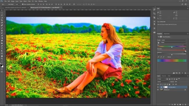
Terms and Tools Used In Color Grading
These are the most common terminologies photo editors use when color grading an image:
● Hue
Hue is the general name for describing pure color. That means it defines color without alluding to its brightness, vividness, etc. It describes a color’s position in the color wheel.
● Saturation
When a photo editor talks about saturation, they refer to the hue concentration that defines a specific color. Saturation describes color shades and focuses on how colorful they are. Examples of colors with zero saturation are white, black, and grey.
● Luminance
Luminous describes how bright, well-lighted or dark a color is. Highlights, mids, and shadows can influence luminance.
● Additive Color
Additive colors are non-primary colors. However, they typically result from mixing primary colors (blue, red, green).
● Color Cast
Color cast means that the image’s coloring doesn’t look as natural as it should be. This usually happens when different light sources get mixed.
● Temperature
Temperature defines how cool or warm a color is. Cool temperatures typically describe blues and purples, while orange and red represent the warmth.
The essential tools for color grading include
● White Balance
White balance helps to make your photos look more natural by correcting color cast issues. After using white balance, the result is that the whites in your pictures would look exactly like the human eye will perceive it. White balance adjusts your image’s color cast to make them look warmer or cooler.
● Brightness and Contrast
Brightness and contrast are essential in color grading and are among the most used photo editing tools. Different sliders control brightness and contrast during editing. It’s important to note that your image’s brightness will affect the contrast and vice-versa. That’s why they usually appear together, even if they refer to different tools.
● The Three-Way Color Corrector
Many photographers refer to the three-way corrector as the color correction’s workhorse. That’s because this tool adjusts hue, saturation, brightness, and contrast in a single interface. The three-way corrector performs the job of three tools in one interface. Using the three-way corrector ensures that you work faster than usual.
● The Fast Color Corrector
The fast color corrector is like the three-way corrector. However, there are many limitations with the number of potential looks you can achieve with this tool. The fast color corrector primarily focuses on adjusting tint and saturation. Its major advantage over the three-way corrector is its user-friendliness and simplicity.
● Curves
While using curves is pretty complicated, the tool offers impressive functionality that you can’t refuse. Curves are very powerful and precise. Their main function is to overhaul or remove your image’s brightness altogether to give it a distinctive look.
● The Unsharp Mask and Sharpening Tools
With the unsharp mask and sharpening tools, you can give your picture’s edges a sharp illusion by modifying the contrast. This is typically useful for images that you shoot in dark conditions.
Sharp pictures are always a lovely sight. However, these tools can’t correct pictures taken out of focus. To get the best results from these tools. Then you can start moving them back till you get your desired sharpness.
● Color Match
As the make implies, color match tools modify a target picture’s colors to fit the reference image. This is an automatic process and helps to save time.
Common Steps To Color Grade a Photo
These are the essential stages for color grading your images:
● Step 1:
The first step in color grading is deciding how warm or cool you want your image to look. Then, modify the white balance to suit your desired warmth or coolness.
● Step 2:
After adjusting the white balance, the next step is to adjust saturation or hue.
● Step 3:
The next step is to focus on the histogram. A histogram is a common feature in many photo editing software that informs you of your image’s tonal values. The goal in this stage is to ensure equal color distribution. Keep adjusting your image till the colors are even.
● Step 4:
Work on your highlights and shadows by modifying the green, red, and blue curves. Also, adjust your vibrancy setting for a good effect.
● Step 5:
Explore split toning. Split toning is a process that involves adding colors to highlight and shadows independently. Learning how to split tone can make a difference in your photo editing.
Tips For Color Grading Photography
The following best practices will enhance your color grading:
- About oversaturation or under-saturation. Your saturation should be just right to produce the perfect result. So, always be sure to pay maximum attention to this process. This tip is particularly useful when working with portraits.
- Remember that color grading doesn’t fix a bad shot. So, be sure to improve your photography skills and take the best shots for excellent color grading results.
- Shoot your images in RAW. Doing this guarantees more control over your pictures’ colors.
- Always experiment with different looks until you get your precise effect. Lightroom is one of the best color grading apps to use.
- Exercise maximum caution when manipulating backgrounds. Don’t do too much, especially when you’re taking an indoor shot. That’s because manipulating indoor backgrounds too much can mismatch the foreground and background, making your portrait look weird.
Conclusion
● While your photography skills are essential in influencing your image’s outcome; your color grading skills will take it to another level. It’s one of the fastest ways to make a budding photo editor look like a pro.
● After reading this article, you can be sure that you have the basic information you need to achieve your editing goals. However, you mustn’t stop here. Continuous learning, especially through constant practice, is the way to go. You can visit Filmora today for the best color grading packages and tools.
Have you recognized how flat your images look when you take them with your camera? While the scenery may be beautiful and your photography skills may be amazing, there’s always something missing. That “thing” is color grading, and that may be why your favorite superstar’s pictures appear better than yours. You can color grade your videos to produce the same effect too.
Color grading photography refers to a post-production process that improves your images by altering their color. The result of an excellent color grading process is an image that looks more appealing and refined. It’s what gives a picture some professional touch.
If you want to learn more about color grading photography, this article will let you in on all you need to know. From essential color grading steps to terms, tools, etc., you can begin your journey to cool and exciting images after reading.
In this article
01 Don’t Confuse Color Grading With Color Correction
03 Common Steps To Color Grade a Photo
04 Tips For Color Grading Photography
Don’t Confuse Color Grading With Color Correction
The first way to fully appreciate color grading is by differentiating it from its closest term—color correction. Many people use both of them interchangeably, and that’s wrong. Although color grading and color correction are post-production processes that enhance image colors, they perform different roles.
Here’s how to differentiate color grading from color correction:
| Differentiating Factor | Color Grading ; | Color Correction |
|---|---|---|
| Definition | Color grading is a process that enhances an image’s color by stylizing or giving it a cinematic appearance. | Color correction is a process that adjusts color mistakes in an image by giving it a consistent appearance. This process balances colors by adjusting whites and blacks. |
| Purpose | The primary aim of color grading an image is to evoke specific emotions in the viewers. Color grading leverages the emotional and psychological effects of colors to manipulate the viewers’ moods. You can use color grading to give your images different tones or themes like fear, femininity, youthfulness, passion, anger, sadness, etc. | Unlike color grading, the color correction does very little in setting the tone or mood that an image carries. Instead, it corrects specific mistakes in the image to make it look as natural to the human eyes as possible. Generally, camera lenses and the human eyes view pictures differently. Color correction changes a photo’s look to make it more appealing to humans than the camera. It makes black colors appear darker and adds more white to whites to create the desired effect. |
| Stage in the production process | Color grading typically comes after color correction in the post-production process. That’s because the effects of color grading are more appealing on a color-corrected picture. | Color correction comes before color grading. This process does the major work of balancing colors and correcting errors. Color grading only fine-tunes what color correction has done, giving it a professional finish. |
| Example | One of the most obvious examples of color grading is in motion pictures. For example, Sci-Fi movies typically have a very saturated blue color. However, you will notice a little redder in romantic movies. Note that filmmakers can use different color grades in movies to draw attention to specific details or represent changes in the storyline. Color grading produces the same effects in pictures. | Color correction is most prominent in documentaries to make pictures and videos look more real to the human eye. Other times, color corrections just adjust one color to merge the rest of the image or video. |
Terms and Tools Used In Color Grading
These are the most common terminologies photo editors use when color grading an image:
● Hue
Hue is the general name for describing pure color. That means it defines color without alluding to its brightness, vividness, etc. It describes a color’s position in the color wheel.
● Saturation
When a photo editor talks about saturation, they refer to the hue concentration that defines a specific color. Saturation describes color shades and focuses on how colorful they are. Examples of colors with zero saturation are white, black, and grey.
● Luminance
Luminous describes how bright, well-lighted or dark a color is. Highlights, mids, and shadows can influence luminance.
● Additive Color
Additive colors are non-primary colors. However, they typically result from mixing primary colors (blue, red, green).
● Color Cast
Color cast means that the image’s coloring doesn’t look as natural as it should be. This usually happens when different light sources get mixed.
● Temperature
Temperature defines how cool or warm a color is. Cool temperatures typically describe blues and purples, while orange and red represent the warmth.
The essential tools for color grading include
● White Balance
White balance helps to make your photos look more natural by correcting color cast issues. After using white balance, the result is that the whites in your pictures would look exactly like the human eye will perceive it. White balance adjusts your image’s color cast to make them look warmer or cooler.
● Brightness and Contrast
Brightness and contrast are essential in color grading and are among the most used photo editing tools. Different sliders control brightness and contrast during editing. It’s important to note that your image’s brightness will affect the contrast and vice-versa. That’s why they usually appear together, even if they refer to different tools.
● The Three-Way Color Corrector
Many photographers refer to the three-way corrector as the color correction’s workhorse. That’s because this tool adjusts hue, saturation, brightness, and contrast in a single interface. The three-way corrector performs the job of three tools in one interface. Using the three-way corrector ensures that you work faster than usual.
● The Fast Color Corrector
The fast color corrector is like the three-way corrector. However, there are many limitations with the number of potential looks you can achieve with this tool. The fast color corrector primarily focuses on adjusting tint and saturation. Its major advantage over the three-way corrector is its user-friendliness and simplicity.
● Curves
While using curves is pretty complicated, the tool offers impressive functionality that you can’t refuse. Curves are very powerful and precise. Their main function is to overhaul or remove your image’s brightness altogether to give it a distinctive look.
● The Unsharp Mask and Sharpening Tools
With the unsharp mask and sharpening tools, you can give your picture’s edges a sharp illusion by modifying the contrast. This is typically useful for images that you shoot in dark conditions.
Sharp pictures are always a lovely sight. However, these tools can’t correct pictures taken out of focus. To get the best results from these tools. Then you can start moving them back till you get your desired sharpness.
● Color Match
As the make implies, color match tools modify a target picture’s colors to fit the reference image. This is an automatic process and helps to save time.
Common Steps To Color Grade a Photo
These are the essential stages for color grading your images:
● Step 1:
The first step in color grading is deciding how warm or cool you want your image to look. Then, modify the white balance to suit your desired warmth or coolness.
● Step 2:
After adjusting the white balance, the next step is to adjust saturation or hue.
● Step 3:
The next step is to focus on the histogram. A histogram is a common feature in many photo editing software that informs you of your image’s tonal values. The goal in this stage is to ensure equal color distribution. Keep adjusting your image till the colors are even.
● Step 4:
Work on your highlights and shadows by modifying the green, red, and blue curves. Also, adjust your vibrancy setting for a good effect.
● Step 5:
Explore split toning. Split toning is a process that involves adding colors to highlight and shadows independently. Learning how to split tone can make a difference in your photo editing.
Tips For Color Grading Photography
The following best practices will enhance your color grading:
- About oversaturation or under-saturation. Your saturation should be just right to produce the perfect result. So, always be sure to pay maximum attention to this process. This tip is particularly useful when working with portraits.
- Remember that color grading doesn’t fix a bad shot. So, be sure to improve your photography skills and take the best shots for excellent color grading results.
- Shoot your images in RAW. Doing this guarantees more control over your pictures’ colors.
- Always experiment with different looks until you get your precise effect. Lightroom is one of the best color grading apps to use.
- Exercise maximum caution when manipulating backgrounds. Don’t do too much, especially when you’re taking an indoor shot. That’s because manipulating indoor backgrounds too much can mismatch the foreground and background, making your portrait look weird.
Conclusion
● While your photography skills are essential in influencing your image’s outcome; your color grading skills will take it to another level. It’s one of the fastest ways to make a budding photo editor look like a pro.
● After reading this article, you can be sure that you have the basic information you need to achieve your editing goals. However, you mustn’t stop here. Continuous learning, especially through constant practice, is the way to go. You can visit Filmora today for the best color grading packages and tools.
Looking for Simple Steps to Apply Fade in Effect to Your Text in Premiere Pro? Here Are Two Different Methods Along with an Alternative Way to Fade Text in Videos
Every video is unappealing until you edit the video properly. Editing videos not only means trimming out unnecessary parts but also adding effects and animations. There are certain effects and transitions that are commonly used in most videos. Fade in effect is widely used in texts, objects, as well as clips. Fade in effect is very eye-soothing that does not distract the audience from the overall video content.
Fade in effect is available in all video editors. Among video editors, Adobe Premiere Pro is one of the best professional video editors. However, the learning curve of Premiere Pro is steep and hence, you have to know the exact steps to add fade in text Premiere Pro. We will illustrate how to apply fade in text effect Pro as well as add fade in and fade out transition effects in Premiere Pro. We will also state an alternative way to fade in texts in your videos.
Part 1. Fade in text in Premiere Pro with Opacity option
If you have added any text or any graphical object in your video on Premiere Pro, you can apply fade in effect to your text and object easily. When you add fade in effect to your text or object, they slowly appear on the screen which is very soothing to watch instead of sudden and abrupt appearance. Here are the steps on how to fade text in Premiere Pro.
Step1 You must have your video clip as well as text clip on the Timeline of Premiere Pro. Make sure that you add text from Essential Graphics panel. Select the text clip from the Timeline to proceed.
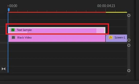
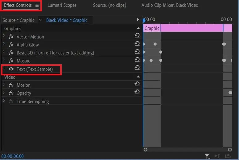
Step2 Go to Effect Controls and click on Text option to expand it. Click on Opacity option from the dropdown menu.
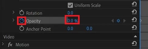
Step3 Put the timeline cursor at the beginning of the selected text clip. Thereafter, make the Opacity value to zero. Click on Stopwatch icon beside Opacity to add a keyframe.
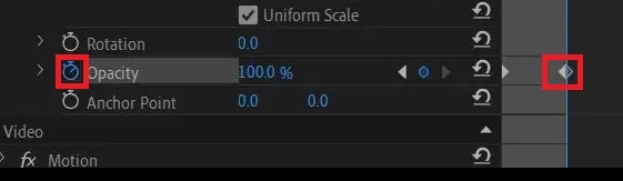
Step4 Put the timeline cursor at that point in the clip where you want the text to appear completely. Now make the Opacity value to 100. Click on Stopwatch to add a keyframe here.
Step5 Play the video to watch the fade in effect on your selected text. You can move the keyframes to speed up or slow down fade in effect.
Part 2. Make fade in or out with transition effects
If you have multiple video clips or scenes, you should add fade in and fade out transition effects so that the transition from one clip to another or one scene to another is smooth. The fade in or fade out effect for video clips look similar to fade text Premiere Pro. In fact, you can use the steps of how to fade in text in Premiere Pro to get the job done. But there is an easier way available with Video Transitions option. Here are the steps on how to apply fade in or out effect on your video clips in Premiere Pro.
Step1 You should have multiple video clips added to Timeline. Select the video clip to which you want to apply Fade in effect.
Step2 Go to Effects panel and click on Video Transitions option.
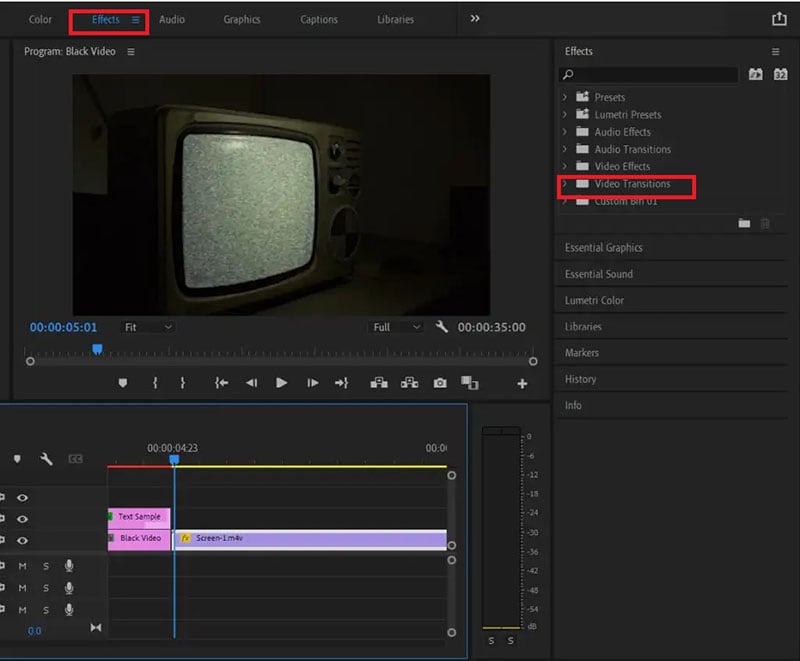
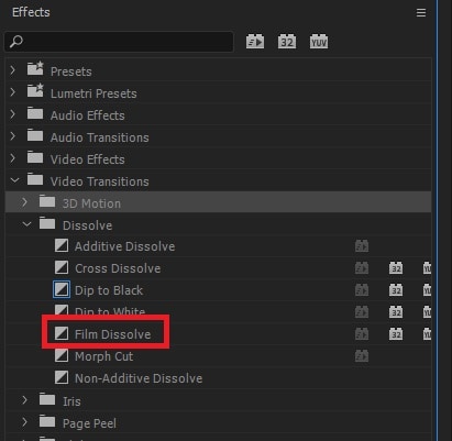
Step3 Click on Dissolve and from the dropdown list, drag and drop Film Dissolve to the beginning of the selected video clip for fade in effect.
Step4 Click on the added effect on Timeline to adjust speed, duration, and alignment of the effect.
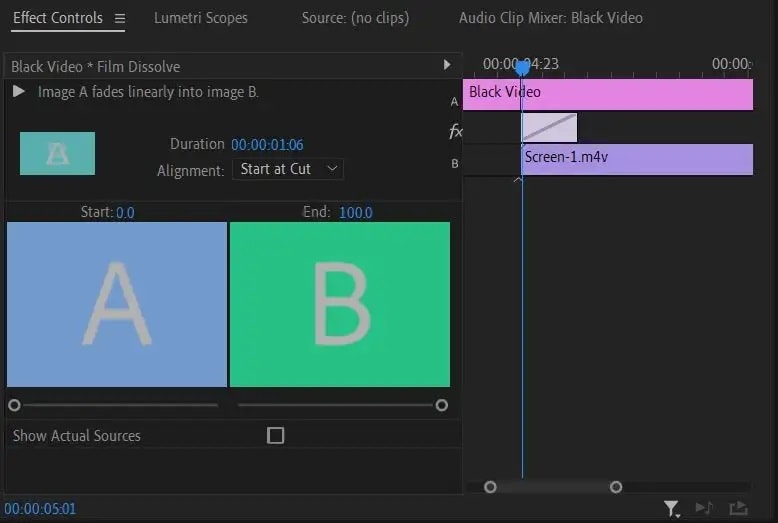
Step5 Play the video to ensure that the effect looks perfect. Therefore, go to File> Share> Export File to save the video.
You can place the transition at the end of the video for fading out effect. Instead of Film Dissolve, you can use Crossfade or Dip to Black effect for fade in and fade out effect on video clips.
Part 3. Alternative way to fade in text in videos
If you do not have Adobe Premiere Pro or you find the steps difficult to fade in text in videos using Premiere Pro, we recommend Wondershare Filmora . Filmora is a professional video editor that is available for Windows as well as Mac users. There is a wide range of video effects available in Filmora in comparison to Premiere Pro. Most importantly, Filmora is super easy and intuitive to use, and even amateur users can use it comfortably. Here are the steps to fade in text in videos using Filmora.
Free Download For Win 7 or later(64-bit)
Free Download For macOS 10.14 or later
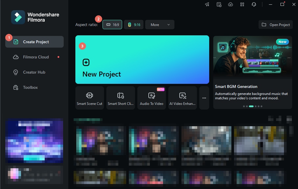
Step1 Download and install Filmora . Launch Filmora and click on New Project option.
Step2 Import the video clip under Project Media folder. Drag and drop the video clip to Timeline.
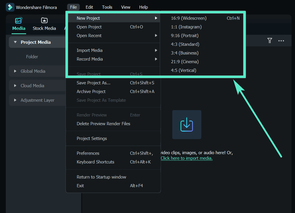
Step3 Go to Titles located at the top and drag and drop any title style on Timeline. Double-click on the Title clip on Timeline and type in your required text in the Viewer. You can stretch the Title clip to extend its duration as per your requirement.
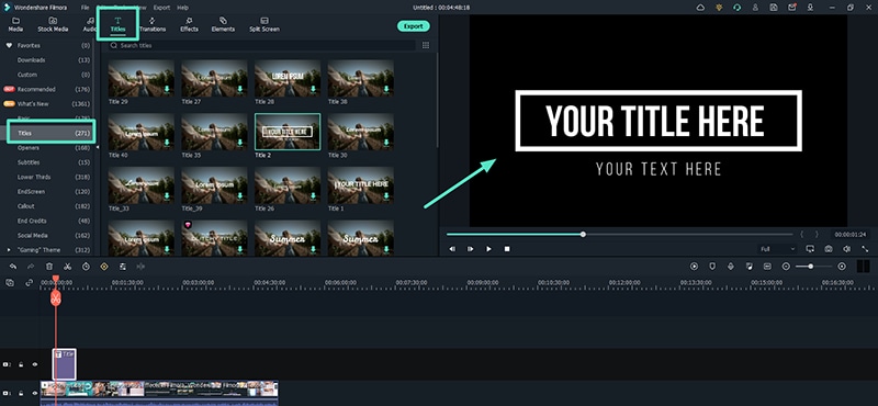
Step4 Double-click on Title clip again on the Timeline and go to Text> Animation tab located at the top-left corner. Scroll down to go to Fade1 option and double-click Fade1 to apply it to your text.
Step5 You can go to settings by clicking on Advanced button and adjust parameters such as speed and duration of the fade effect for better visibility.
Step6 Once you are done, play the video and thereafter, click on Export to save the video on your hard drive.
Conclusion
We have stated the steps on how to fade text in Premiere Pro. You can use the same steps to apply the effect to graphical objects. We have also illustrated how to apply fade in and fade out effects between video clips and scenes using transition effects. If you are looking for an alternative and easier way to fade in texts in your videos, we recommend Wondershare Filmora .
Free Download For macOS 10.14 or later
Step1 Download and install Filmora . Launch Filmora and click on New Project option.
Step2 Import the video clip under Project Media folder. Drag and drop the video clip to Timeline.
Step3 Go to Titles located at the top and drag and drop any title style on Timeline. Double-click on the Title clip on Timeline and type in your required text in the Viewer. You can stretch the Title clip to extend its duration as per your requirement.
Step4 Double-click on Title clip again on the Timeline and go to Text> Animation tab located at the top-left corner. Scroll down to go to Fade1 option and double-click Fade1 to apply it to your text.
Step5 You can go to settings by clicking on Advanced button and adjust parameters such as speed and duration of the fade effect for better visibility.
Step6 Once you are done, play the video and thereafter, click on Export to save the video on your hard drive.
Conclusion
We have stated the steps on how to fade text in Premiere Pro. You can use the same steps to apply the effect to graphical objects. We have also illustrated how to apply fade in and fade out effects between video clips and scenes using transition effects. If you are looking for an alternative and easier way to fade in texts in your videos, we recommend Wondershare Filmora .
Difference Between Time Lapse and Hyperlapse
You’ve probably heard the terms “hyperlapse” and “timelapse” before. Whether it was in a blog post, a how-to guide, or on your preferred social media platform. Each of us has seen at least one image of one of them. However, what makes a difference? You’re about to learn in this article!
With that said, let’s begin!
Part 1. What is a timelapse, and how is it used?
Timelapses are familiar to you, whether they were used in a series to demonstrate a swift change from night today or at the beginning of your favorite influencer’s vlog. But exactly what is it? The term “timelapse” refers to a photography method in which static images are stitched together to produce a time-warping video. When the video is played, the time seems to pass more quickly, creating the illusion that time is slipping away.
Put your camera in a fixed position, stop it from moving, panning, or tilting, then record for a long time to make your own timelapse. This period of time could last for five minutes, an hour, days, or even years. Once the film is gathered, all that’s left to do is speed everything up.
The fact that time-lapses make for a pleasant visual effect is what makes them so popular in Vlogs and other media. This method enables you to describe the passage of time, the movement of individuals through space, etc. utilizes time-lapse.
Part 2. What is a hyperlapse?
On the other side, there are these things that we refer to as hyperlapses. In the subgenre of time-lapse photography known as cinematography, a hyperlapse is a filmmaking method used to generate motion shots by capturing movies rather than taking images. In order to create a hyperlapse, the camera does not remain stationary; rather, it follows the subject around and is typically held by the photographer.
The amount of time that elapses between pictures in a stop-motion video typically ranges from tenths of a second up to a few fractions of a second, although this can change significantly depending on what you want to show. However, after you have picked it, it must remain consistent in the same way that the timelapse does.
The attractive 3D look that hyperlapse produces is the primary draw for its utilization. The hyperlapse that is formed can produce a dreamy image, regardless of whether the camera is attached to a moving vehicle or is mounted on a tripod that is moving towards its target.
Additionally, you may use this approach to make stunning photographs with motion blur by employing long exposures. In most cases, the final image will be stabilized in post-production in order to eliminate some of the flaws that may have been captured in the original photo.
Part 3. What differentiates them from each other?
The movement of the camera is what differentiates these two approaches the most from one another. When capturing a time lapse, the camera is kept relatively still and in the same position throughout. In addition, when you use a hyperlapse, the camera is continuously moving, which creates a 3D appearance in the image.
You could be scratching your head right about now, wondering when you should employ one of the two methods. If your subject is moving, you should take a time-lapse photograph; if the camera is moving, you should take a hyperlapse photograph. This question has a relatively straightforward answer.
The act of recording video for a hyperlapse can cause your storage to be filled up really rapidly. Therefore, you may wish to swap between the two methods depending on the length of time that you want to shoot for. If you are going to be filming for a significant amount of time, you should consider using a timelapse.
It is simple to determine the timelapse interval if you already know these answers. Choose the video’s final frame rate. It may be 24, 25, or 30 fps. You shouldn’t select more quickly. Choose the option that best fits your audience and location. Additionally, a time-lapse calculator is available.
The shoot time should then be converted to seconds. For instance, two hours are equal to 2 x 60 x 60 seconds, or 7200 seconds. Determine how many frames are required for your chosen timelapse now. For instance, the final product should be 30 seconds of 25fps video. You’ll need to capture 750 frames in total because 30 x 25 is 750.
Divide the time (7200s in this case) by the number of frames to obtain the interval (750). You can round up the result, which is 9.6, which is pretty near to 10 seconds. Therefore, in our case, your interval should be set to 10s.
Part 4. Motion control timelapse
Now that we understand how the timelapse images that are static are created, we are able to incorporate some movement into the shots that are static. Moving the camera around during a timelapse is much more difficult than it appears to be in the video. Every movement of the camera is slowed down when using slow motion, which means that you can make even a shaky handheld movie look good when using slow motion. The situation is completely reversed while viewing a timelapse.
Because every movement of the camera is sped up, shooting with the handheld mode is nearly impossible. If you want the camera to appear to be moving slowly in the final timelapse, you will need to move it very slowly while shooting in order to achieve this effect.
For this reason, we will need to make use of motion control devices in order to accomplish our goal. Therefore, we refer to these kinds of photos as motion control timelapses. The camera can be moved very slowly and accurately along one, two, or all three axes using motors that are controlled electronically. The three-axis systems, which include a slider as well as a pan-tilt head, are by far the most popular.
Extra Info: Best Time Lapse Video Maker – Filmora
To create a time lapse video with cool effects, you can use the best video editor with rich effects – Filmora . This software offers many video speed change settings and creative effects to help make a time lapse video easily. Just download the software on your PC or Mac and then start creating a video on your own.
Conclusion
The finest results can be achieved by utilizing a variety of filmmaking approaches concurrently. Therefore, you shouldn’t be afraid to try out new things by combining time-lapse photography with slow motion and video. In addition, make sure you visit the Hyperlapse Academy so you can become familiar with all of the different approaches. Use your imagination, and don’t stop firing.
Free Download For Win 7 or later(64-bit)
Free Download For macOS 10.14 or later
Free Download For macOS 10.14 or later
A Detailed Guid to Remove Background From a Video in Premier Pro
Adobe Premiere Pro is one of the leading video editing software. You can use to create or remove a video’s background. Advanced Chroma Key features such as Color Key and Ultra Key make it possible to produce background-free content quickly.
Although both Keys work similarly, many users prefer to use the Ultra key for a better result in the video. This article will explain how to remove video background in Premiere Pro if you are a newbie.
Let’s get right to it and start the tutorial!
How to Use Premiere Pro to Remove Video Background?
Adobe Premiere Pro can remove video backgrounds quickly using the Ultra Key feature with the following steps:
Step1 In the first step, launch a browser, and download the appropriate Adobe Premiere Pro version for your Windows PC or Mac . Next, install the software on your system and launch it from your Desktop or Dock.
Step2 Now, use the Media Browser panel in the software to browse the video clips you want to import into the software. Next, right-click on your selected video file in which you want to remove the background and choose the “Import” option.
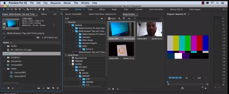
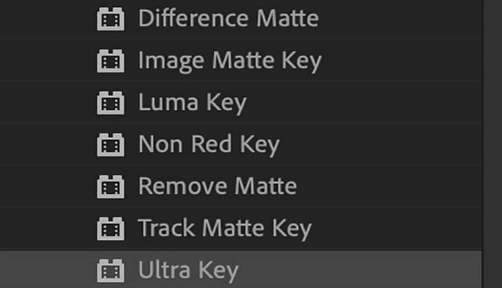
Step3 Click the “Effects” tab in the software panel and select Video Effects. Here, you will see the “Keying” option; select the Ultra Key, press and hold it to grab the key, and place it on your video clip.
![]()
Note: You can also search for the Ultra Key in the Adobe Premiere Pro search bar. Drag it to the video clip containing a background you want to remove.
Step4 As soon as you drop the Ultra Key to your footage, an Effects Control panel will pop up. Next, use the eyedropper tool in the Effects Control panel. Finally, select the background color on your video that you want to remove.
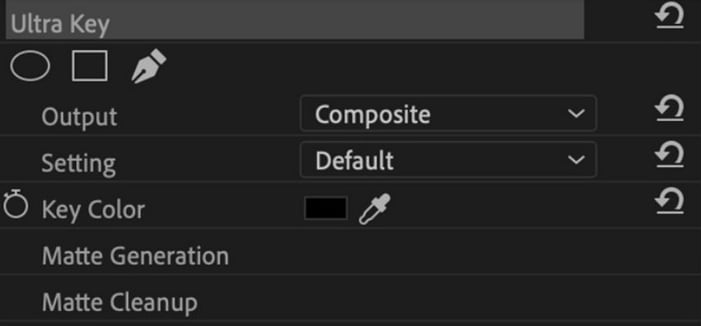
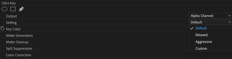
Step5 In the next step, click the drop-down menu next to the “Output” option, and select “Alpha Channel” from the list. This will reveal the details of your video and the edits. Also, click the “Setting” drop-down menu and select the Relaxed, Aggressive, or Custom option for the video effect.
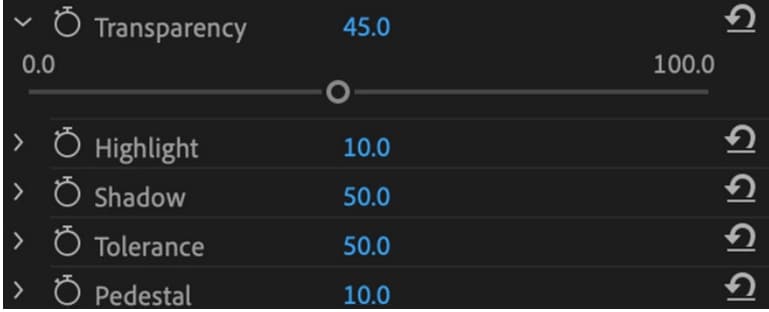
Step6 Select the “Matte Generation“ below Key Color. Try different levels for Highlight, Shadow, Tolerance, Transparency, Pedestal, and other settings to further clean the matte for a premium effect.
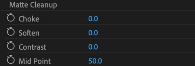
Step7 In this step,choose the “Matte Cleanup” option to expand its settings and clean up the edges of your clip. You will see various options here, but the most important one is “Choke.” It will shrink the object’s borders and “Soften” to add fuzz.
If you see a background color spill on your video after playing with the above settings, click “Spill Suppression” beneath Matte Cleanup to expand its options and choose the desired settings to resolve this issue.
That’s about it! You have successfully removed the video background in Premiere Pro.
Step8 In the last step, you need to save, render, and export your video with the removed background. To do this, click the “File” option on the Premiere Pro Media Browser, and choose “Export” to explore the “Media” menu.
Choose the format in the Export Settings, as it is compatible with most devices. Next, choose a valid Preset and resolution, and click “Export” to begin the rendering process. Finally, save your edited background video again, and export the video to the desired destination.
Is There Any Best Alternative to Remove Video’s Background?
Although Adobe Premiere Pro is an excellent choice, the software can be a little overzealous for beginners. But don’t fret; there is an alternative for newbie to remove the video background.
Many video content creators recommended Wondershare Filmora as a user-friendly video editing software. This software loads with customization options and compact feature, including the Human Segmentation effect. With it, you can isolate objects from the background of a video without a green screen.
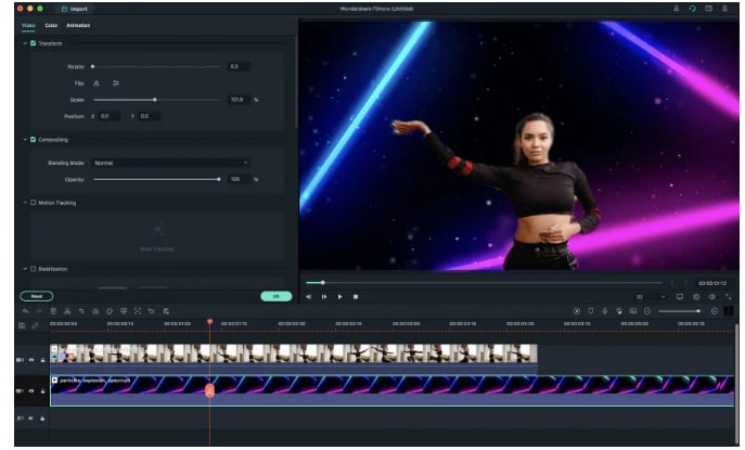
Let’s take a quick look at Filmora video editing marvel features:
- Comes with a free trial and is priced to meet most video designers’ production needs.
- Remove the video background with four quick steps.
- View the foreground of your video in real-time after background removal.
- Numerous customization options to add a different background or an image to the original content.
- Add the removed background as an overlay on top of another clip.
- Drag and drop a video clip to another track in the timeline for cutting, trimming, and elimination purposes.
- Using the “Human Segregation effect” in the AI Portrait on any imported video is simple.
- See objects isolated from the background in the Preview mode, which allows you to adjust the edges, feathers, and thickness accordingly.
- Easy export options supporting various compatible formats.
Additionally, we have provided you with a video tutorial about How to Remove and Change Video Background Without Green Screen with Filmora:
Free Download For Win 7 or later(64-bit)
Free Download For macOS 10.14 or later
Conclusion
This comprehensive guide explains how to remove the video background in Premier Pro using the Ultra key instead of the Color Key.
We have also discussed an excellent alternative to Premier Pro that can eliminate any background in your video content within minutes.
This article helped solve your queries. As a result, you can now create quality video content for your audience without paying thousands of dollars to professional video editors to do the background removal for you.
Step4 As soon as you drop the Ultra Key to your footage, an Effects Control panel will pop up. Next, use the eyedropper tool in the Effects Control panel. Finally, select the background color on your video that you want to remove.
Step5 In the next step, click the drop-down menu next to the “Output” option, and select “Alpha Channel” from the list. This will reveal the details of your video and the edits. Also, click the “Setting” drop-down menu and select the Relaxed, Aggressive, or Custom option for the video effect.
Step6 Select the “Matte Generation“ below Key Color. Try different levels for Highlight, Shadow, Tolerance, Transparency, Pedestal, and other settings to further clean the matte for a premium effect.
Step7 In this step,choose the “Matte Cleanup” option to expand its settings and clean up the edges of your clip. You will see various options here, but the most important one is “Choke.” It will shrink the object’s borders and “Soften” to add fuzz.
If you see a background color spill on your video after playing with the above settings, click “Spill Suppression” beneath Matte Cleanup to expand its options and choose the desired settings to resolve this issue.
That’s about it! You have successfully removed the video background in Premiere Pro.
Step8 In the last step, you need to save, render, and export your video with the removed background. To do this, click the “File” option on the Premiere Pro Media Browser, and choose “Export” to explore the “Media” menu.
Choose the format in the Export Settings, as it is compatible with most devices. Next, choose a valid Preset and resolution, and click “Export” to begin the rendering process. Finally, save your edited background video again, and export the video to the desired destination.
Is There Any Best Alternative to Remove Video’s Background?
Although Adobe Premiere Pro is an excellent choice, the software can be a little overzealous for beginners. But don’t fret; there is an alternative for newbie to remove the video background.
Many video content creators recommended Wondershare Filmora as a user-friendly video editing software. This software loads with customization options and compact feature, including the Human Segmentation effect. With it, you can isolate objects from the background of a video without a green screen.
Let’s take a quick look at Filmora video editing marvel features:
- Comes with a free trial and is priced to meet most video designers’ production needs.
- Remove the video background with four quick steps.
- View the foreground of your video in real-time after background removal.
- Numerous customization options to add a different background or an image to the original content.
- Add the removed background as an overlay on top of another clip.
- Drag and drop a video clip to another track in the timeline for cutting, trimming, and elimination purposes.
- Using the “Human Segregation effect” in the AI Portrait on any imported video is simple.
- See objects isolated from the background in the Preview mode, which allows you to adjust the edges, feathers, and thickness accordingly.
- Easy export options supporting various compatible formats.
Additionally, we have provided you with a video tutorial about How to Remove and Change Video Background Without Green Screen with Filmora:
Free Download For Win 7 or later(64-bit)
Free Download For macOS 10.14 or later
Conclusion
This comprehensive guide explains how to remove the video background in Premier Pro using the Ultra key instead of the Color Key.
We have also discussed an excellent alternative to Premier Pro that can eliminate any background in your video content within minutes.
This article helped solve your queries. As a result, you can now create quality video content for your audience without paying thousands of dollars to professional video editors to do the background removal for you.
Also read:
- 2024 Approved Boost Your Spirit Creating Motivational Status Videos
- In 2024, Learn How to Seamlessly Merge Audio and Video in VLC Media Player with This Easy-to-Follow Guide. Step-by-Step Instructions Are Included
- New Discover the Process of Slowing Down Time-Lapse Videos on Your iPhone for 2024
- 2024 Approved 20 Best Text To Speech Software Windows, Mac, Android, iPhone & O
- How to Do Perfect Match Paint 100 the Easy Way for 2024
- Updated 2024 Approved Deleting White Background in Photoshop Is Hard? No
- New Figuring Out Proper Ways to Play a Video in Slow Motion on iPhone
- New Unleash the Power of Video Slow Motion with Wondershare Filmora. Find Out How to Create Slow Motion Video with the Effective Speed Ramping Feature on Filmora
- New In 2024, Best Green Screen Software for Beginner on Mac
- Updated 2024 Approved Have You Recently Experienced Motion Blur in Games? Do You Wish to Learn More About It? This Article Provides an Overview and the Need for Motion Blur Gaming
- Best 7 Color Match Paint Apps for 2024
- Make Super Easy Coin Magic With Filmora for 2024
- New 2024 Approved Do You Know You Can Use Mobile Apps to Apply Camera Effects to Your Videos? Many Smartphone Applications Allow You to Apply Camcorder Effects
- New 2024 Approved In This Article, Youll Find Four Solutions for Rotating Your Go-Pro Videos. The Following Tools Will Be Used for This Purpose
- Boost Your Spirit Creating Motivational Status Videos for 2024
- Updated What Is First Impression Review Video
- In 2024, Find a Video Background Change Online that Works for You. This Article Contains Tools that Can Edit Video Backgrounds Online with Little Effort
- Updated How to Create a Glitch Text Effect?
- How to Make a Video by Mouse with Filmora
- New Fast Method to Match Color in Photoshop for 2024
- How to Fade to Black Premiere Pro
- How to Stream Apple iPhone 13 mini to Computer? | Dr.fone
- Troubleshooting Error Connecting to the Apple ID Server On iPhone 12
- In 2024, How Can You Transfer Files From Motorola Moto G84 5G To iPhone 15/14/13? | Dr.fone
- Methods to Change GPS Location On Apple iPhone 6s | Dr.fone
- In 2024, How to Unlock T-Mobile iPhone 13 Pro Max online without SIM Card?
- How Can Poco X5Mirror Share to PC? | Dr.fone
- Ultimate Guide to Free PPTP VPN For Beginners On Realme Narzo 60x 5G | Dr.fone
- How Can I Use a Fake GPS Without Mock Location On Apple iPhone 15 Pro? | Dr.fone
- How to Reset OnePlus Nord N30 5G Without the Home Button | Dr.fone
- In 2024, How Can I Use a Fake GPS Without Mock Location On Huawei Nova Y71? | Dr.fone
- In 2024, Top 7 Skype Hacker to Hack Any Skype Account On your Apple iPhone 7 Plus | Dr.fone
- Full Guide to Bypass Lava Yuva 3 FRP
- In 2024, How to Unlock Oppo A2 Pattern Lock if Forgotten? 6 Ways
- Top 4 SIM Location Trackers To Easily Find Your Lost Infinix Smart 8 HD Device
- In 2024, Change Location on Yik Yak For your Oppo F23 5G to Enjoy More Fun | Dr.fone
- How to Unlock Samsung Galaxy XCover 6 Pro Tactical Edition Pattern Lock if Forgotten? 6 Ways
- In 2024, Ways To Find Unlocking Codes For Nokia G310 Phones
- Title: Everything You Need to Know About Color Grading in Photography
- Author: Morgan
- Created at : 2024-07-01 13:02:14
- Updated at : 2024-07-02 13:02:14
- Link: https://ai-video-editing.techidaily.com/everything-you-need-to-know-about-color-grading-in-photography/
- License: This work is licensed under CC BY-NC-SA 4.0.
