
:max_bytes(150000):strip_icc():format(webp)/GettyImages-944229088-5bd1f61e46e0fb0026fdf2f0.jpg)
Updated 6 Ways to Mimic Professional Filming Gears for 2024
6 Ways to Mimic Professional Filming Gears
The professional and expensive gears are primarily out of budget for starters. But there is no need to stop filming because household things will give good output.
In this article, you will learn 6 pro tips to make professional filming gear using cardboard, container, and tape. It will turn out into POV and barrel roll shots. Scroll more to learn the top ways, and then enjoy the rest with your audience.
Part 1. Things to Remember Before Making Gears
Before using tools for professional videos, you should remember some side effects and cautions to make everything reliable and simple. Read the below outlines!
Not Professional Results
You should remember that homemade tools will give you different results than professional gear because they are expensive for a purpose. But you can experiment and get fun during filming with these products.
Safety Measures
If you use any heavy or temperature-sensitive equipment, you should take safety before operating them.
Handle Carefully
Before experimenting, make sure that you are holding everything tightly. Ensure that no accident occurs during filming!
After taking precautions and understanding the output, it’s time to make tools and film!
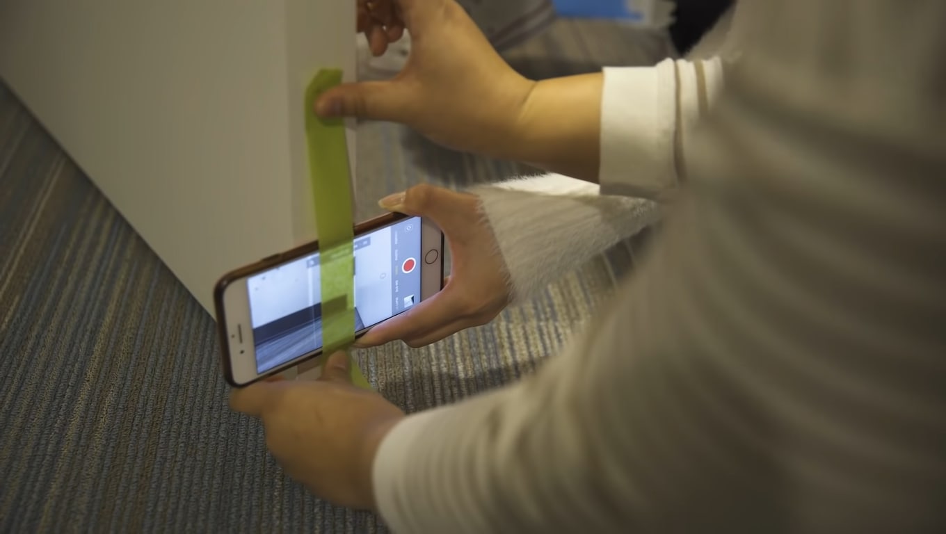
Part 2. Smooth Camera Movement with A Door
With a simple mobile camera, you can make smooth shots of any action, like walking, running, and playing. There is no need to get any professional gear.
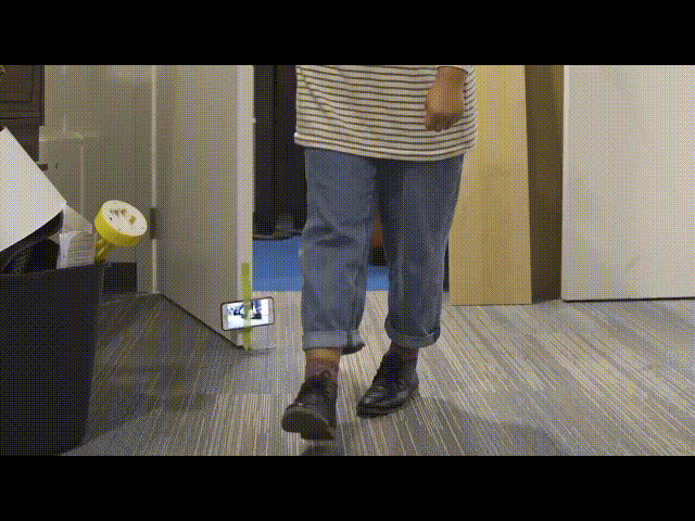
It easy to achieve by attaching a camera to the door. You can use duct or any other tape which is easily available in the home. Fasten the mobile phone to the side of the door with tape, as shown below!
Moving the door while performing any action will result in smooth shots. Check out the final results below.
Part 3. Film Shots of Underwater
Filming underwater is always a dream of any videographer, but we were limited to get shots from the water’s surface. So now it’s time to add more creativity to your video.
First, you need to take a transparent container or any glass container. Pour water according to your need in it.
![]()
Note: Ensure the container is light enough to put on the phone.
Then, place the container on the lens of the phone to make a video. Then, take care of the phone from the water.
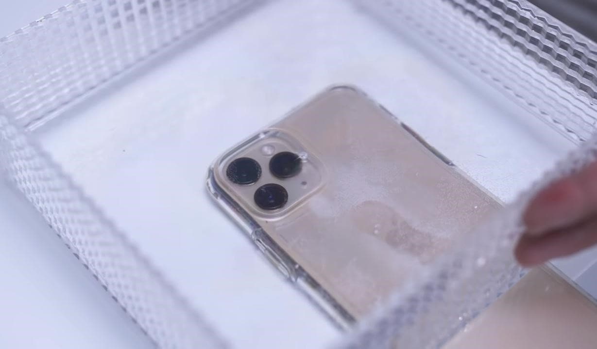
Pro Tip: You can also shine light source in water and add glitter or colors to get more astonishing shots.
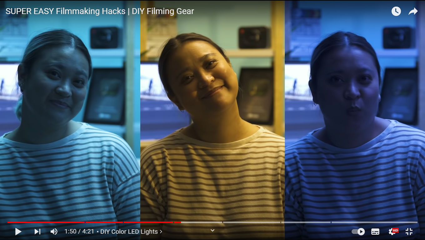
Part 4. Make Colourful Shots Without Coloured Lights
All filmmakers love party lights and want to add colors like that in the video. Different colored lights in videos usually represent different mood swings and enhance the creativity of storytellers.
Professional videographers use expensive lights to give these effects. But you don’t need to purchase any expensive gear. Because you can make colorful shots easily with colored plastic binder dividers, or you can also use cellophane wraps.
First, wrap the colored divider around the LED light or any light you use to shoot video.
![]()
Note: Check the light temperature after short intervals because it melts or burns the dividers when the light source gets hot.
Now make the video and try with different colors to add suspense, horror, and happy effects to the video.
The video still needs more creative effects and designs; scroll more to read exciting tips.
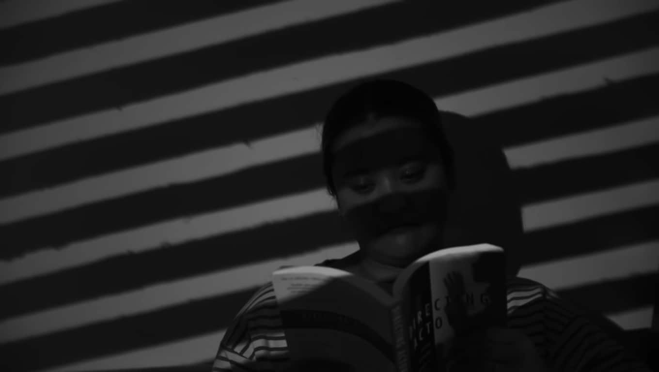
Part 5. Different Shapes of Light with Cardboard
To add a fantasy location in the video and make light effects in the form of shapes, try out easily available cardboard. Most of the time, aesthetic videos are made by these hacks, giving viewers different vibes.
Only a professional photographer and videographer know how to attract the audience to the shots by doing these simple hacks.
The interesting thing is that if light has more shape, it will precisely describe more about the scene’s backstory, location, and context. Give it a try!
Step1 Cutting of cardboards
Cut the cardboard in any shape, whatever you want. We will experiment by cutting cardboard in window blinds shape.
![]()
Note: There is no specific recommendation for the cardboard, you can use any size or shape which suits you the best.

Step2 Make shots in different shapes of light
After giving shape, now move the cardboard around the light source and make a video. It seems like the subject is sitting near the window and has aesthetic vibes.
![]()
Note: The more precise the cutting of cardboard, the more professional it looks.
Become more creative and make more shapes with cardboard because the audience always prefers new content in the market.
Part 6. Create Point of View Shots
After adding colors and shapes, now it’s time to get some Point of View (POV) shots. Most of the time, viewers become bored by watching framing and filming coverages.
POV shots are mostly captured from a specific angle to show an object’s characters. They are mostly seen in food commercials, and videographers of snacks just love to make these shots.
To make POV shots, there is nothing specific required. You just have to make a suitable position for the lens. Follow the below guidelines and capture it!
Step1 Cut ends of packet
To create POV shots of your favorite snack, first of all, cut down both ends of the packets.
Step2 Attach packet on a camera
After cutting, attach the packet of snacks to the camera lens or phone with the help of old-fashioned tape.
Ensure the camera is turned on, and then make a POV shot. Now, it’s time to enjoy the rest part with the audience. Check out the final results, as shown below!
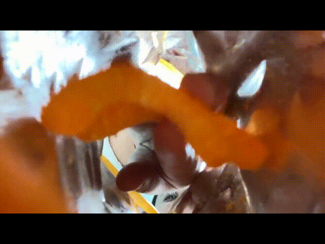
Due to this, the food seems good, and you can notice the number of spices too. This one actually looks amazing!
What if we add the rotatory shots, too, in the video? For this, check out the last tip and try that!
Part 7. Create a Barrel Roll Shot
Barrel roll shots are the full axial shot by spinning the camera lens. Epic shots that formerly required costly gimbals and sophisticated techniques are now as simple as strolling.
It’s pretty easy to make a rotatory shot at 360° by using equipment easily available at home. Rolling may feel anxiety and disorientation. Filmmakers utilize it to confuse or unnerve audiences in movies.
There is no need to purchase expensive gambles to make barrel roll clips. Instead, try this hack by utilizing a power drill present at your home. Then, follow the below steps to give it a professional look!
Step1 Take equipment
First, take a camera lens or smartphone, whatever you are using to make a video, and a power drill as a gimbal.
Step2 Camera with drill
Attach the camera to the power drill with the help of old-fashioned tape.
![]()
Note: You should have a piece of square foam or soft block placed between the camera and drill to assist.
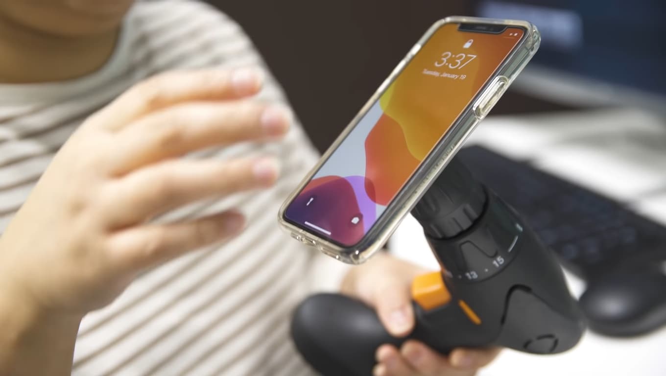
Now, it’s time to turn on the drill and ensure that the video option is “Turn On” in the camera. Then, enjoy the shots of 360° with your audience!

Conclusion
Finally, you get a filmy video after performing above mentioned 6 DIY hacks without expensive gear. More creativity in a video attracts more audience, which makes you more prior in the videography industry.
You can also try more tools at home and share your ideas with others to get reviews on them and make better changes. Make sure that you are taking all safety measures and precautions.
Then, place the container on the lens of the phone to make a video. Then, take care of the phone from the water.
Pro Tip: You can also shine light source in water and add glitter or colors to get more astonishing shots.
Part 4. Make Colourful Shots Without Coloured Lights
All filmmakers love party lights and want to add colors like that in the video. Different colored lights in videos usually represent different mood swings and enhance the creativity of storytellers.
Professional videographers use expensive lights to give these effects. But you don’t need to purchase any expensive gear. Because you can make colorful shots easily with colored plastic binder dividers, or you can also use cellophane wraps.
First, wrap the colored divider around the LED light or any light you use to shoot video.
![]()
Note: Check the light temperature after short intervals because it melts or burns the dividers when the light source gets hot.
Now make the video and try with different colors to add suspense, horror, and happy effects to the video.
The video still needs more creative effects and designs; scroll more to read exciting tips.
Part 5. Different Shapes of Light with Cardboard
To add a fantasy location in the video and make light effects in the form of shapes, try out easily available cardboard. Most of the time, aesthetic videos are made by these hacks, giving viewers different vibes.
Only a professional photographer and videographer know how to attract the audience to the shots by doing these simple hacks.
The interesting thing is that if light has more shape, it will precisely describe more about the scene’s backstory, location, and context. Give it a try!
Step1 Cutting of cardboards
Cut the cardboard in any shape, whatever you want. We will experiment by cutting cardboard in window blinds shape.
![]()
Note: There is no specific recommendation for the cardboard, you can use any size or shape which suits you the best.
Step2 Make shots in different shapes of light
After giving shape, now move the cardboard around the light source and make a video. It seems like the subject is sitting near the window and has aesthetic vibes.
![]()
Note: The more precise the cutting of cardboard, the more professional it looks.
Become more creative and make more shapes with cardboard because the audience always prefers new content in the market.
Part 6. Create Point of View Shots
After adding colors and shapes, now it’s time to get some Point of View (POV) shots. Most of the time, viewers become bored by watching framing and filming coverages.
POV shots are mostly captured from a specific angle to show an object’s characters. They are mostly seen in food commercials, and videographers of snacks just love to make these shots.
To make POV shots, there is nothing specific required. You just have to make a suitable position for the lens. Follow the below guidelines and capture it!
Step1 Cut ends of packet
To create POV shots of your favorite snack, first of all, cut down both ends of the packets.
Step2 Attach packet on a camera
After cutting, attach the packet of snacks to the camera lens or phone with the help of old-fashioned tape.
Ensure the camera is turned on, and then make a POV shot. Now, it’s time to enjoy the rest part with the audience. Check out the final results, as shown below!
Due to this, the food seems good, and you can notice the number of spices too. This one actually looks amazing!
What if we add the rotatory shots, too, in the video? For this, check out the last tip and try that!
Part 7. Create a Barrel Roll Shot
Barrel roll shots are the full axial shot by spinning the camera lens. Epic shots that formerly required costly gimbals and sophisticated techniques are now as simple as strolling.
It’s pretty easy to make a rotatory shot at 360° by using equipment easily available at home. Rolling may feel anxiety and disorientation. Filmmakers utilize it to confuse or unnerve audiences in movies.
There is no need to purchase expensive gambles to make barrel roll clips. Instead, try this hack by utilizing a power drill present at your home. Then, follow the below steps to give it a professional look!
Step1 Take equipment
First, take a camera lens or smartphone, whatever you are using to make a video, and a power drill as a gimbal.
Step2 Camera with drill
Attach the camera to the power drill with the help of old-fashioned tape.
![]()
Note: You should have a piece of square foam or soft block placed between the camera and drill to assist.
Now, it’s time to turn on the drill and ensure that the video option is “Turn On” in the camera. Then, enjoy the shots of 360° with your audience!
Conclusion
Finally, you get a filmy video after performing above mentioned 6 DIY hacks without expensive gear. More creativity in a video attracts more audience, which makes you more prior in the videography industry.
You can also try more tools at home and share your ideas with others to get reviews on them and make better changes. Make sure that you are taking all safety measures and precautions.
Finding The Best Filmic Pro LUTs For Video Editing
Video editing involves rearranging and upscaling video content for improved quality. Meanwhile, video editing can consume a lot of time and resources. For video editing, you need to have expertise in using the software. The ideal solution is using Filmic Tone LUTs for free download. These LUTs can extend the quality of your videos in a hassle-free environment. This article will discuss important Filmic Pro LUTs.
- Part 2: Discussing Some Practical Uses of LUTs in Video Editing
- Part 3: Best Filmic Pro LUTs To Use
- Part 4: Getting To Know Wondershare Filmora and Its Use in LUTs
Part 1: How Can LUTs Benefit Video Editors?
Video editors are professionals that are tasked to edit and customize videos. Their main objective is to enhance video quality with necessary manual upscaling. Making things more accessible, find how LUTs can benefit these professionals:
- Increased Efficiency: With LUTs, video editors can optimize their workflows with ready-made filters. So they don’t need to spend hours on video editing. By applying filters, video colors are upgraded.
- Consistent Grading: During manual editing, multiple frames are left out during color correction. With LUTs, the colors are applied in a consistent way in all frames. This way, you will experience effective color enhancement.
- Professional Quality: The quality of applied LUTs is amazing. After all, LUTs provide dedicated filter presets to optimize color saturation and brightness. With professional color grading, experience a top-quality video.
- Creative Colors: LUTs are ideal for adding premium yet stylish color schemas into videos. The color gradients are creative as well as sleek and luxurious. You will not regret using creative color presets in LUTs.
Part 2: Discussing Some Practical Uses of LUTs in Video Editing
LUTs, also known as look-up tables, are unique video editing tools. They use mathematical instructions to map input color values into output color values. This way, consistent color gradings are applied across video content. In video editing, LUTs can be used for a variety of practical uses:
1. Special Effects
By using LUTs, you can add special effects to your videos. This includes different effects, including dreamy, moody, or surreal. The videos will look more professional and enchanting with attractive looks. So you don’t need to pursue video editing in a deep way.
2. HDR Display
With LUTs, users can add a dynamic touch of HDR display to the videos. After all, they can convert SDR footage to HDR footage using special filter presets. This allows for different color contrasts within the video.
3. Color Enhancement
Enhancing color schemas is easier and more convenient using LUTs. These editing tools can adjust color contrast, balance, and saturation. Hence, your video is upscaled with an improved color display for vintage or cinematic looks.
4. Match Footages
Different cameras produce videos with diverse quality, which is unsatisfying. Through LUTs, you can match the color of your footage with a consistent appearance. The color schemes and tone contrasts are optimized in a collective way.
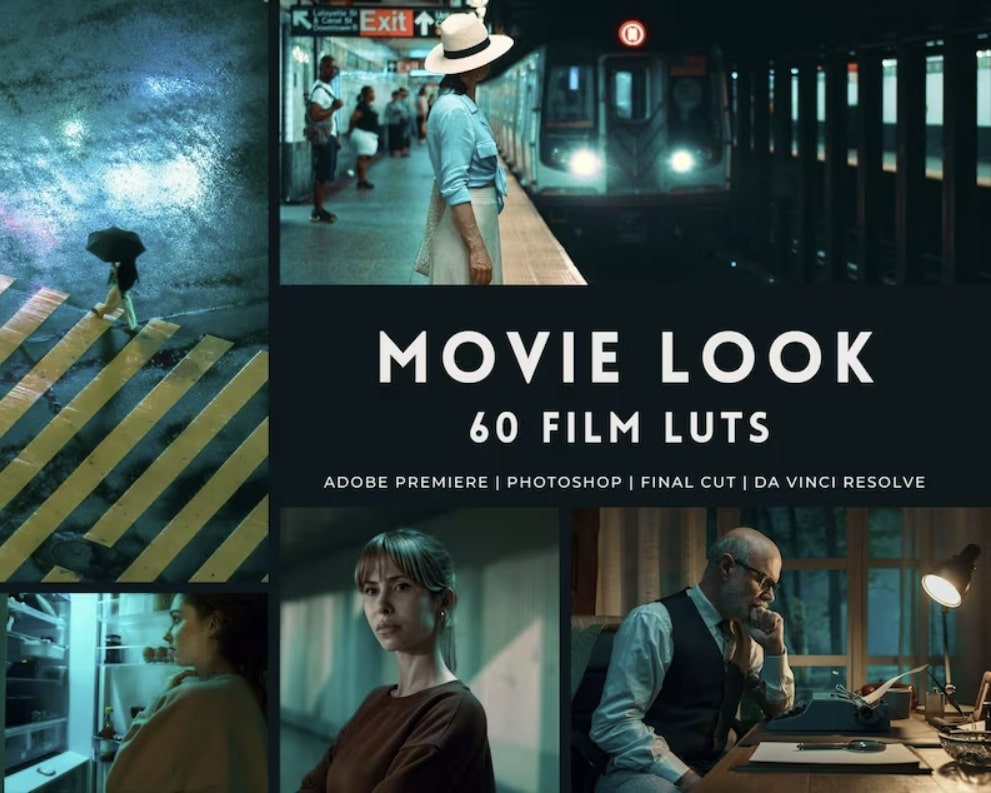
Part 3: Best Filmic Pro LUTs To Use
Using LUTs in video editing can save a lot of time. For video editors, LUTs can be revolutionizing because of less effort with amazing output. In general, using Filmic Pro LUTs is in great demand. Let’s discover some of them:
1. Filmic LUT Support
Bring Filmic looks to your videos using this Filmic Pro LUTs download pack. There are up to 7 different LUT preset filters that you can import. With Filmic touch, you can add unique cinematic looks to your visual content. LUT Quick Action Modal (QAM) is also introduced to switch into preview mode or apply LUT to the video.
2. Richard Lackey FREE Filmic Pro LOGv2 LUT for FilmConvert
Add a cinematic touch to your videos with this Filmic Tone LUTs free download pack. This special LUTs pack lets you add attractive film interaction to your video. The provided color schemes are exceptional because they offer unique color presentations. Meanwhile, the LUT equips solutions to correct imbalances and noise.
3. Free LUT Filmic
Make your photo or video more special with this Free LUT Filmic pack. Meanwhile, there are special effects for transforming color schemas within visual content. So, if you have film or photography, the provided LUT filters are amazing. This way, you can spark creativity like a professional editor. The video content will become more appealing.
4. Film Slog3 And Standard LUTs
Enhance your visual creativity by blending premium looks into your videos. After all, this Filmic Pro LUT download pack has fantastic color upscaling solutions. It contains a collection of 20 Film REC 709 LUTs and 20 Film Slog3 LUTs to adapt. This way, you can improve the color gradients of your social media videos and presentations.
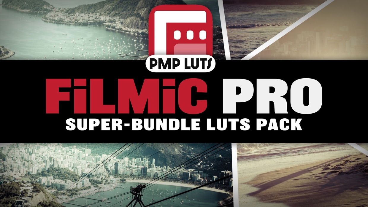
5.FILMIC PRO SUPER-BUNDLE LUTS PACK
Enhancing video quality is now easier with this color-grading Filmic Pro pack. This is a specialized LUTs bundle that incorporates 50 cinematic filter presets. The available LUTs can generally optimize color gradients with the right contrasts. So if you have flat or log footage, using this LUT can be ideal. Meanwhile, the LUT is designed explicitly for mobile-captured videos.
6.Filmic Tone LUTs
Upgrade your preset library with this amazing Filmic Tone LUTs pack. While featuring 10 preset filters, this LUTs pack provides an aesthetic dark, moody tone. LUTs are easily applied to your videos with the right color upscaling. You will also receive a VLOG - Rec709 LUT and Sony SLOG2/3 - Rec709 LUT. The supported file format is .cube.

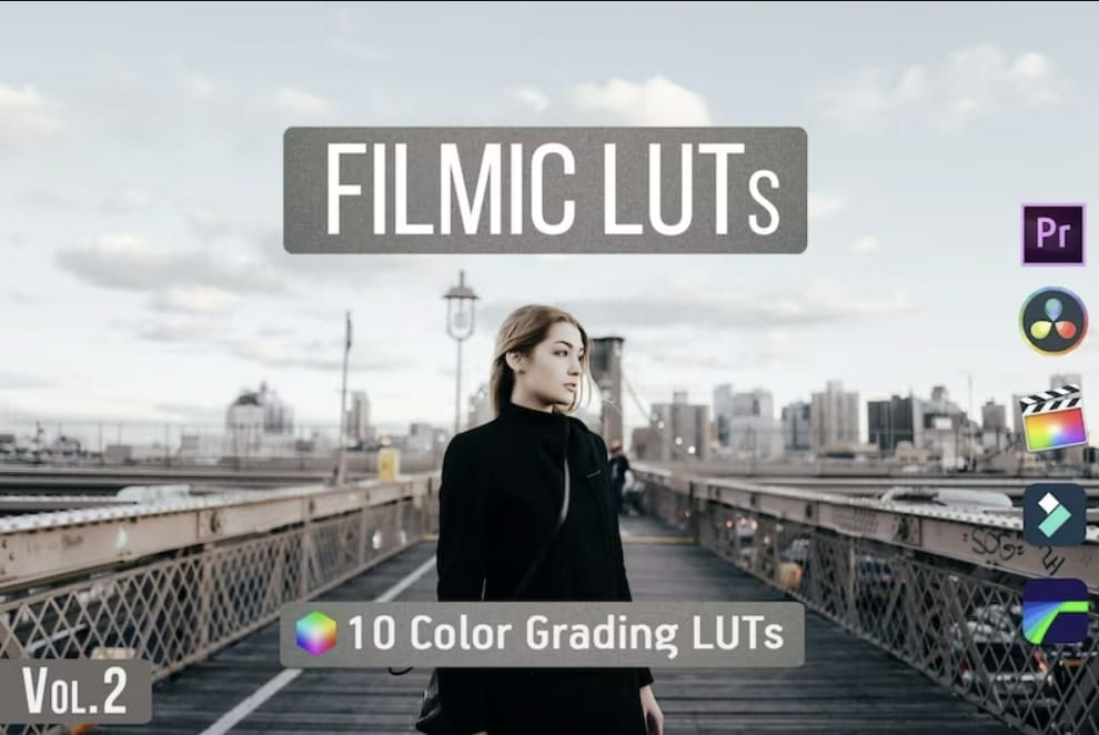
7. 7. Filmic LUTs Vol.2
Working with LUTs has never been this easy. So when you use Filmic LUTs Vol.2, you will get 10 creative LUT preset filters. Integrate these LUTs into your visual content to upscale their quality. Meanwhile, the LUTs can be used on different editing platforms. In most instances, you will get upscaling results within seconds. There is also an option to adjust intensity, contrast, and more.
8. 50 Cinematic Retro Film LUTs Pack
Add a retro touch to your videos with this Filmic Pro LUT download pack. After all, there are 50 retro-styled Filmic LUT presets. When you apply these LUTs to your video, special color grading is applied. Every specific LUT has a unique color schema with a styled theme. In this LUTs pack, you will also receive a PDF guide with step-by-step instructions.
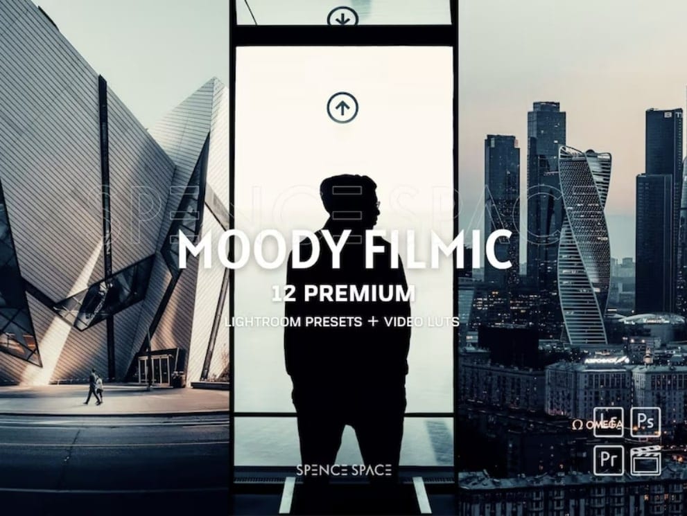
9. Moody Filmic Cityscape LR Presets
Moody Filmic retouches are always special and exciting. When adding them to visual content, you can extend quality in an optimal way. After all, this Filmic Tone LUTs free download pack has 12 filter presets. This way, you can enhance color grading with the right correction standards. You can use these filter presets on both mobile and the web.
10. Movie Cinematic Film LUTs
Transform color grading within your visual content with this cinematic film LUTs pack. To sum up, there are 50 different cinematic LUTs in this pack. So, while using these LUTs, color saturation and brightness will upgrade your visual content. The good thing is the LUTs are compatible with both video and image formats.
Part 4: Getting To Know Wondershare Filmora and Its Use in LUTs
Wondershare Filmora is an industrial-standard video editing software. Meanwhile, this software is ideal for all video editors because it offers various video enhancements. There are 200+ LUTs in this editing tool which includes color grading Filmic Pro. Thus, you can upscale video colors in an optimized way in different styles.
![]()
Note: Filmora has AI tools like AI Smart Cutout, AI Audio Denoise, and Auto Reframe. Moreover, you can also enjoy the perks of AI copywriting for ready-made video scripts. With motion tracking, speed ramping, and keyframing, video editing becomes simpler. In addition, there are several options for effects, transitions, and stickers. This makes it a complete and comprehensive video editing solution for the masses.
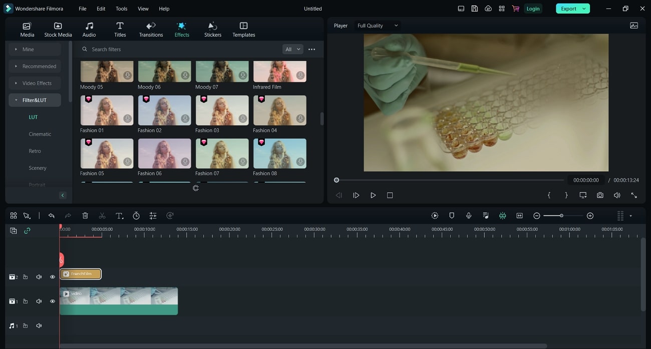
Empower your videos with a new mood using different LUTs. Filmora now offers 100+ top-quality 3D LUTs cover a broad range of scenarios. Transform your videos with Filmora’s powerful 3D LUTs.
Apply LUT on Videos Apply LUT on Videos Learn More


Conclusion
LUTs are pre-defined color gradients that work in an instant way. Meanwhile, they make video editing simpler and smarter. This article illustrated 10 top Filmic Pro LUTs free download. By using these LUTs, you can upscale your important videos with improved color schemas. In addition, you discovered a vital editing tool, Wondershare Filmora. Within this software, you can upscale videos with multiple functionalities.
Part 1: How Can LUTs Benefit Video Editors?
Video editors are professionals that are tasked to edit and customize videos. Their main objective is to enhance video quality with necessary manual upscaling. Making things more accessible, find how LUTs can benefit these professionals:
- Increased Efficiency: With LUTs, video editors can optimize their workflows with ready-made filters. So they don’t need to spend hours on video editing. By applying filters, video colors are upgraded.
- Consistent Grading: During manual editing, multiple frames are left out during color correction. With LUTs, the colors are applied in a consistent way in all frames. This way, you will experience effective color enhancement.
- Professional Quality: The quality of applied LUTs is amazing. After all, LUTs provide dedicated filter presets to optimize color saturation and brightness. With professional color grading, experience a top-quality video.
- Creative Colors: LUTs are ideal for adding premium yet stylish color schemas into videos. The color gradients are creative as well as sleek and luxurious. You will not regret using creative color presets in LUTs.
Part 2: Discussing Some Practical Uses of LUTs in Video Editing
LUTs, also known as look-up tables, are unique video editing tools. They use mathematical instructions to map input color values into output color values. This way, consistent color gradings are applied across video content. In video editing, LUTs can be used for a variety of practical uses:
1. Special Effects
By using LUTs, you can add special effects to your videos. This includes different effects, including dreamy, moody, or surreal. The videos will look more professional and enchanting with attractive looks. So you don’t need to pursue video editing in a deep way.
2. HDR Display
With LUTs, users can add a dynamic touch of HDR display to the videos. After all, they can convert SDR footage to HDR footage using special filter presets. This allows for different color contrasts within the video.
3. Color Enhancement
Enhancing color schemas is easier and more convenient using LUTs. These editing tools can adjust color contrast, balance, and saturation. Hence, your video is upscaled with an improved color display for vintage or cinematic looks.
4. Match Footages
Different cameras produce videos with diverse quality, which is unsatisfying. Through LUTs, you can match the color of your footage with a consistent appearance. The color schemes and tone contrasts are optimized in a collective way.
Part 3: Best Filmic Pro LUTs To Use
Using LUTs in video editing can save a lot of time. For video editors, LUTs can be revolutionizing because of less effort with amazing output. In general, using Filmic Pro LUTs is in great demand. Let’s discover some of them:
1. Filmic LUT Support
Bring Filmic looks to your videos using this Filmic Pro LUTs download pack. There are up to 7 different LUT preset filters that you can import. With Filmic touch, you can add unique cinematic looks to your visual content. LUT Quick Action Modal (QAM) is also introduced to switch into preview mode or apply LUT to the video.
2. Richard Lackey FREE Filmic Pro LOGv2 LUT for FilmConvert
Add a cinematic touch to your videos with this Filmic Tone LUTs free download pack. This special LUTs pack lets you add attractive film interaction to your video. The provided color schemes are exceptional because they offer unique color presentations. Meanwhile, the LUT equips solutions to correct imbalances and noise.
3. Free LUT Filmic
Make your photo or video more special with this Free LUT Filmic pack. Meanwhile, there are special effects for transforming color schemas within visual content. So, if you have film or photography, the provided LUT filters are amazing. This way, you can spark creativity like a professional editor. The video content will become more appealing.
4. Film Slog3 And Standard LUTs
Enhance your visual creativity by blending premium looks into your videos. After all, this Filmic Pro LUT download pack has fantastic color upscaling solutions. It contains a collection of 20 Film REC 709 LUTs and 20 Film Slog3 LUTs to adapt. This way, you can improve the color gradients of your social media videos and presentations.
5.FILMIC PRO SUPER-BUNDLE LUTS PACK
Enhancing video quality is now easier with this color-grading Filmic Pro pack. This is a specialized LUTs bundle that incorporates 50 cinematic filter presets. The available LUTs can generally optimize color gradients with the right contrasts. So if you have flat or log footage, using this LUT can be ideal. Meanwhile, the LUT is designed explicitly for mobile-captured videos.
6.Filmic Tone LUTs
Upgrade your preset library with this amazing Filmic Tone LUTs pack. While featuring 10 preset filters, this LUTs pack provides an aesthetic dark, moody tone. LUTs are easily applied to your videos with the right color upscaling. You will also receive a VLOG - Rec709 LUT and Sony SLOG2/3 - Rec709 LUT. The supported file format is .cube.
7. 7. Filmic LUTs Vol.2
Working with LUTs has never been this easy. So when you use Filmic LUTs Vol.2, you will get 10 creative LUT preset filters. Integrate these LUTs into your visual content to upscale their quality. Meanwhile, the LUTs can be used on different editing platforms. In most instances, you will get upscaling results within seconds. There is also an option to adjust intensity, contrast, and more.
8. 50 Cinematic Retro Film LUTs Pack
Add a retro touch to your videos with this Filmic Pro LUT download pack. After all, there are 50 retro-styled Filmic LUT presets. When you apply these LUTs to your video, special color grading is applied. Every specific LUT has a unique color schema with a styled theme. In this LUTs pack, you will also receive a PDF guide with step-by-step instructions.
9. Moody Filmic Cityscape LR Presets
Moody Filmic retouches are always special and exciting. When adding them to visual content, you can extend quality in an optimal way. After all, this Filmic Tone LUTs free download pack has 12 filter presets. This way, you can enhance color grading with the right correction standards. You can use these filter presets on both mobile and the web.
10. Movie Cinematic Film LUTs
Transform color grading within your visual content with this cinematic film LUTs pack. To sum up, there are 50 different cinematic LUTs in this pack. So, while using these LUTs, color saturation and brightness will upgrade your visual content. The good thing is the LUTs are compatible with both video and image formats.
Part 4: Getting To Know Wondershare Filmora and Its Use in LUTs
Wondershare Filmora is an industrial-standard video editing software. Meanwhile, this software is ideal for all video editors because it offers various video enhancements. There are 200+ LUTs in this editing tool which includes color grading Filmic Pro. Thus, you can upscale video colors in an optimized way in different styles.
![]()
Note: Filmora has AI tools like AI Smart Cutout, AI Audio Denoise, and Auto Reframe. Moreover, you can also enjoy the perks of AI copywriting for ready-made video scripts. With motion tracking, speed ramping, and keyframing, video editing becomes simpler. In addition, there are several options for effects, transitions, and stickers. This makes it a complete and comprehensive video editing solution for the masses.
Empower your videos with a new mood using different LUTs. Filmora now offers 100+ top-quality 3D LUTs cover a broad range of scenarios. Transform your videos with Filmora’s powerful 3D LUTs.
Apply LUT on Videos Apply LUT on Videos Learn More
Conclusion
LUTs are pre-defined color gradients that work in an instant way. Meanwhile, they make video editing simpler and smarter. This article illustrated 10 top Filmic Pro LUTs free download. By using these LUTs, you can upscale your important videos with improved color schemas. In addition, you discovered a vital editing tool, Wondershare Filmora. Within this software, you can upscale videos with multiple functionalities.
How to Edit Facebook eCommerce Video Ads
If you’re running an e-commerce business, then it’s important to create video ads that promote your products. However, making professional-quality videos can be expensive and time-consuming.
Luckily, there’s an easy way to create Facebook video ads that look great without spending a lot of money. All you need is a copy of Wondershare Filmora, which is a powerful yet easy-to-use video editor.
In this article, we’ll show you how to use Filmora to create eCommerce video ads that will help boost your sales.

Why Video Ads Are Effective for E-commerce Business
Video ads are a very effective way to promote your e-commerce business. They can help you reach a wider audience, and they can also be more engaging than traditional advertising methods.
There are a few things to keep in mind when creating video ads for your e-commerce business:
- First, make sure that your videos are high quality and professional-looking.
- Secondly, focus on creating videos that are short and to the point.
- Finally, make sure to include a call to action in your video so that viewers know what they should do after watching it.
Why Use Wondershare Filmora for Editing E-commerce Video Ads
Wondershare Filmora is a powerful video editing software that you can use to create videos for your e-commerce business. It’s also very user-friendly, which means it’s easy to use even if you have no prior experience with video editing software. You can create professional looking videos using this software, and it comes with built-in templates that make it easier for you to get started quickly.
With Wondershare Filmora , creating an e-commerce video ad will be as simple as possible. There are many different options that you can choose from when making these ads such as adding text, photos or graphics using the built-in editor within this program. You can also add audio clips into your video in order to hear sound effects such as music or voice-overs that narrate what viewers see on screen. They have all my favorite amazing features.
Free Download For Win 7 or later(64-bit)
Free Download For macOS 10.14 or later
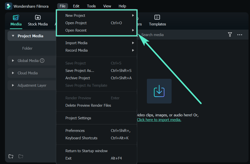
Steps to Edit Facebook Video Ads for E-commerce Business
Step1Prepare your script for Video Editing
To make your Facebook video ad, you need to have a clear idea of what you want to say in the video. This can be done by creating a script for your video. Once you have a script, you can start planning out your video and editing it in Filmora.
Step2Save your video materials
To gather all photos and video materials, you can either use your own personal footage or find stock images and videos online. Once you have all the desired media, save them to a designated folder on your computer so you can easily access them while editing in Filmora.
Step3Open Filmora and click on “Create a New Project.”
Now that you have your content ready, open Filmora and click on “Create a New Project.” This will create a new project file for you to start editing in.
Step4Select the right Project Aspect Ratio
It is important to use the correct project aspect ratio when creating a Facebook video ad because if you don’t, your video may not be in the correct format when it is uploaded to Facebook. When selecting the project aspect ratio, make sure to choose Widescreen (16:9) or Instagram (1:10) to ensure that your video is in the correct format.

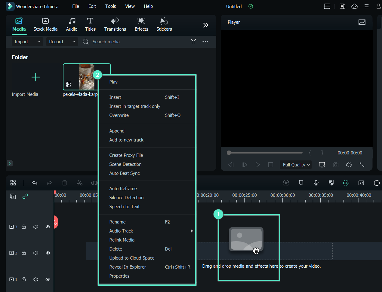
Step5Import your media files into Filmora
Once you have decided on the project aspect ratio, you can start importing your video and photo files. To do this, go to the “Media Library” and click on “Import Media Files.” Find the folder where you saved your content and select all of the files that you want to use. Then, click “Open” to import the files into Filmora.
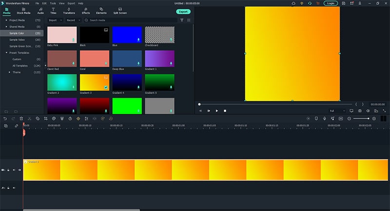
Step6Set the background color for your Facebook Video Ads
Now that you have all of your content imported into Filmora, you can start editing it. One thing you may want to do is set the background color for your video. To do this, go to the “Media” tab and click on the “Sample Color” section. Then, select the desired color for your background. Make sure to use your branding color palette.
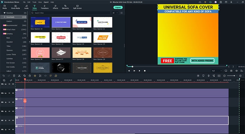
Step7Add Catchy headline and text
This will help to grab the viewer’s attention and explain what your video is about. To do this, go to the “Titler” tab and select the “Titles” option. Then, click on the “Text” tab and type in your headline. You can also add some text to the video by going to the “Text” tab and clicking on the “Add Text” option.
Catchy headlines will help you stand out from the competition and get your video noticed.
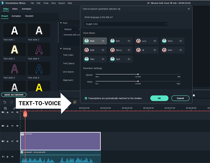
Step8Convert your script into a voice-over narrator
By using text to voice feature, you can generate voice-over that will help you create a more professional video. To do this, go to the “Text” tab and click on the “Add Text” option. Then, type in your script. Once you have finished typing, click on the “Text-ti-Voice Over” button and select the desired language.
Step9Arrange your video clips
Now that you have all of your content imported into Filmora , you can start arranging them into a cohesive video. To do this, go to the “Timeline” tab and drag and drop the desired photos or video clips into the correct order.
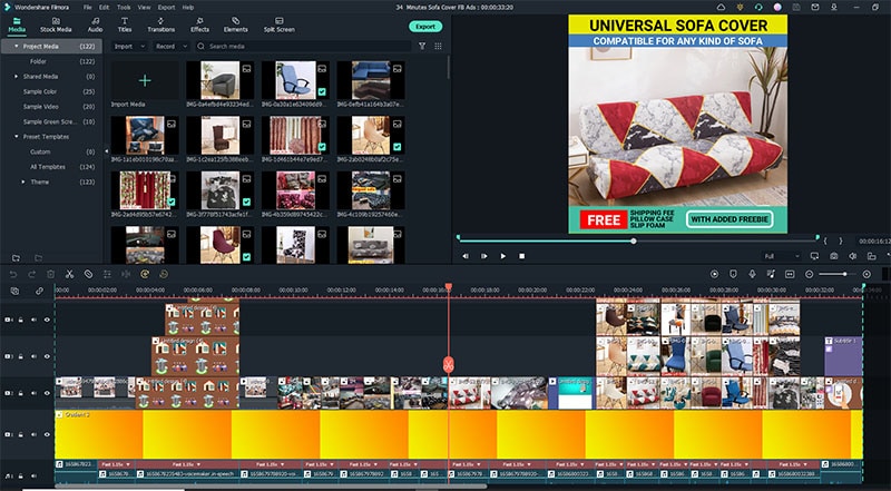
If you need to trim or split any of the photos or video clips, you can do so by using the “Trim” and “Split” options. To trim a photo or video clip, hover over the desired clip and click on the “ scissors “ icon. Then, drag it to the desired location. To split a photo or video clip, hover over the desired clip and click on the “ split “ icon. Then, drag it to the desired location.
You can also add some transitions between the video clips by going to the “Transitions” tab and dragging and dropping the desired transition into place.
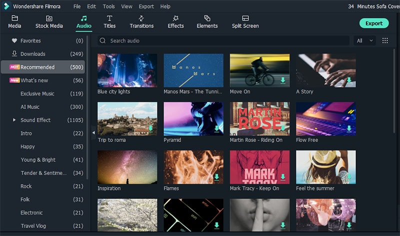
Step10Add music to your video
Adding music to your video will help to set the mood and make your video more engaging. To do this, go to the “Audio” section the select your desired background music for your video. You can also download “no copyright background music” on Youtube.
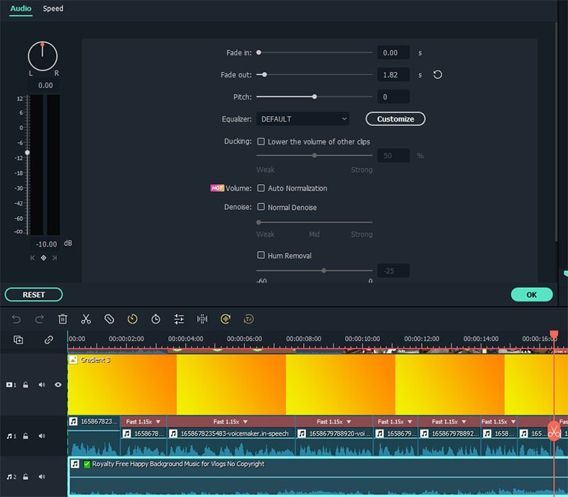
Drag and drop the audio file into place on the timeline. You can also use the “Fade In” and “Fade Out” options to make the music flow better with the video.
Step11Export your Video
To export your video, click on the “Export” button at the top section. Select the desired file format and click “Export” to save your video to your computer.
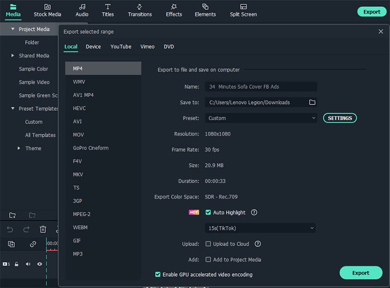
Recommended Export Quality
- Format: MP4
- Resolution: 720 or 1080
- Frame rate 30 fps
Conclusion
Now that you know how to create a Facebook video ad, it’s time to start creating some stellar videos that will help promote your business. By using the tips we’ve provided in this article, you can create videos that stand out from the competition and get noticed by your target audience. Make sure to use catchy headlines, text, and music to engage your viewers and keep them watching until the end. All the best!
Free Download For Win 7 or later(64-bit)
Free Download For macOS 10.14 or later
Free Download For macOS 10.14 or later
Steps to Edit Facebook Video Ads for E-commerce Business
Step1Prepare your script for Video Editing
To make your Facebook video ad, you need to have a clear idea of what you want to say in the video. This can be done by creating a script for your video. Once you have a script, you can start planning out your video and editing it in Filmora.
Step2Save your video materials
To gather all photos and video materials, you can either use your own personal footage or find stock images and videos online. Once you have all the desired media, save them to a designated folder on your computer so you can easily access them while editing in Filmora.
Step3Open Filmora and click on “Create a New Project.”
Now that you have your content ready, open Filmora and click on “Create a New Project.” This will create a new project file for you to start editing in.
Step4Select the right Project Aspect Ratio
It is important to use the correct project aspect ratio when creating a Facebook video ad because if you don’t, your video may not be in the correct format when it is uploaded to Facebook. When selecting the project aspect ratio, make sure to choose Widescreen (16:9) or Instagram (1:10) to ensure that your video is in the correct format.
Step5Import your media files into Filmora
Once you have decided on the project aspect ratio, you can start importing your video and photo files. To do this, go to the “Media Library” and click on “Import Media Files.” Find the folder where you saved your content and select all of the files that you want to use. Then, click “Open” to import the files into Filmora.
Step6Set the background color for your Facebook Video Ads
Now that you have all of your content imported into Filmora, you can start editing it. One thing you may want to do is set the background color for your video. To do this, go to the “Media” tab and click on the “Sample Color” section. Then, select the desired color for your background. Make sure to use your branding color palette.
Step7Add Catchy headline and text
This will help to grab the viewer’s attention and explain what your video is about. To do this, go to the “Titler” tab and select the “Titles” option. Then, click on the “Text” tab and type in your headline. You can also add some text to the video by going to the “Text” tab and clicking on the “Add Text” option.
Catchy headlines will help you stand out from the competition and get your video noticed.
Step8Convert your script into a voice-over narrator
By using text to voice feature, you can generate voice-over that will help you create a more professional video. To do this, go to the “Text” tab and click on the “Add Text” option. Then, type in your script. Once you have finished typing, click on the “Text-ti-Voice Over” button and select the desired language.
Step9Arrange your video clips
Now that you have all of your content imported into Filmora , you can start arranging them into a cohesive video. To do this, go to the “Timeline” tab and drag and drop the desired photos or video clips into the correct order.
If you need to trim or split any of the photos or video clips, you can do so by using the “Trim” and “Split” options. To trim a photo or video clip, hover over the desired clip and click on the “ scissors “ icon. Then, drag it to the desired location. To split a photo or video clip, hover over the desired clip and click on the “ split “ icon. Then, drag it to the desired location.
You can also add some transitions between the video clips by going to the “Transitions” tab and dragging and dropping the desired transition into place.
Step10Add music to your video
Adding music to your video will help to set the mood and make your video more engaging. To do this, go to the “Audio” section the select your desired background music for your video. You can also download “no copyright background music” on Youtube.
Drag and drop the audio file into place on the timeline. You can also use the “Fade In” and “Fade Out” options to make the music flow better with the video.
Step11Export your Video
To export your video, click on the “Export” button at the top section. Select the desired file format and click “Export” to save your video to your computer.
Recommended Export Quality
- Format: MP4
- Resolution: 720 or 1080
- Frame rate 30 fps
Conclusion
Now that you know how to create a Facebook video ad, it’s time to start creating some stellar videos that will help promote your business. By using the tips we’ve provided in this article, you can create videos that stand out from the competition and get noticed by your target audience. Make sure to use catchy headlines, text, and music to engage your viewers and keep them watching until the end. All the best!
Free Download For Win 7 or later(64-bit)
Free Download For macOS 10.14 or later
10 Matching Color Combination That Works Together
10 Matching Color Combination That Works Together
An easy yet powerful editor
Numerous effects to choose from
Detailed tutorials provided by the official channel
Color is abundant in our life. Our moods, sensations, and perceptions, as well as our decision-making processes, are all influenced by color. Emotion evokes by color. It affects our perception, eliciting subconscious or conscious responses in the human brain. Color is perhaps the most robust tool at your disposal as a designer because of its influential and communicative nature.

Although not everyone is born with a keen sense of color or a natural aptitude for graphic design, there are methods and principles you can employ to select the best color that matches together to make a strong impression and achieve your desired effect. Fortunately, we’ve got you backed up. The ten best colors that match everything are listed below to help you create your next design.
In this article
01 [What is a color combination?](#Part 1)
02 [Types of color combinations](#Part 2)
03 [Two-color combination vs. Three-color logo combinations](#Part 3)
04 [How to apply color combinations to your designs?](#Part 4)
Part 1 What is Color Combination?
Color Theory is an art when it comes to playing with colors. It explains how people perceive color and the visual effects of colors mixing, pairing, and contrasting with one another. Designers use a color wheel and considerable collected knowledge about human psychology, society, and more to pick the perfect colors that match everything. Color is a crucial, if not the most important, feature of design since it may affect the meaning of the text, how people move across a layout, and how they feel. You may be more intentional in generating graphics that affect you if you understand color theory.
Part 2 Types of Color Combinations
Learning how different colors match together is essential for successful color combinations. Studying the color wheel and color harmonies (what works, what doesn’t, and how color communicates) will help you blend colors, establish a stronger brand, and share more effectively with your designers and printers.
The color wheel contains:?
● Three primary colors (red, yellow, and blue),?
● Three secondary colors (purple, green, and orange), and?
● Six tertiary colors (colors generated when you mix primary colors), plus (colors created from primary and secondary colors, such as blue-green or red-violet).

Draw a line over the core of the wheel to separate the warm colors (reds, oranges, and yellows) from the cool colors (blues, greens, and purples) (blues, greens, purples).
Warm colors are connected with activity, brightness, and vigor, whereas cold colors are associated with tranquility, peace, and serenity. So when you hold that color has a temperature, you can see how its use might influence your message.
On the color wheel, complementary hues are opposites. They may make artwork jump because of the great contrast between the two hues, but overusing them can get tiring.
Analogous hues are next to each other. Therefore, one color will dominate, one will support, and another will accent when developing a similar color scheme.
Triadic hues are energetic and vibrant, evenly dispersed throughout the color wheel. They provide visual contrast and harmony, allowing everything to shine as the overall image comes to life.
You can build a variety of grand color schemes by using the color wheel. Finding the perfect color combination for the right occasion is vital.
● 10 Matching Color Combination That Works Together
01Yellow and Blue

Yellow is the ultimate attention-getter, and it provides a young backdrop for the commanding navy. The equally electrifying Blue color that matches with Yellow dazzles the senses. It’s one of those color schemes mainly used for parties and casual gatherings. It helps instill a sense of purpose and energy in a design by contributing to enthusiasm.
02Black and Orange

The vibrant orange contrasts wonderfully with the dark black, providing a sense of mystery and suspense. Black is one of my favorite colors that match with orange.
03Lime Green and Purple

This high-octane color combination exudes a powerful presence, with purple being a beautiful choice to compliment light green. That?**color matches the lime green?**and presents a strong sense of design.?
04Dark Brown and Yellow

This fantastic color combination is ideal for creating a design that shouts spontaneity and dependability. The perfect tag-team, marigold yellow, catches the eye while dark brown keeps it. Yellow is yet another favorite pick of color that matches dark brown.
05Lavender and Indigo

Indigo, a dramatic color associated with the arts, is intuitive and forceful. It creates an exciting backdrop for the softer purple shade.
06Turquoise Blue and Purple

The imaginative purple and waterleaf turquoise combination create an overall sensation of limitless possibilities. These colors are ideal for communication-related businesses, such as teachers, trainers, and media communication. Purple is the choice of many designers, and this color matches turquoise blue perfectly.
07Light Pink, Hot Pink & Maroon

The pink color family is your best pick if you’re looking for a design that shouts “approachable.” These colors are distinct enough to provide visual interest to the design while remaining similar sufficient to maintain an innocent appearance. When you add maroon to the mix, you reduce the chance of appearing foolish while also exuding just the appropriate amount of professionalism. Hot Pink and Maroon are my top picks for a color that matches light pink.
08Light Gray and Desert Sand Beige

Although desert sand beige is one of the least-used design colors, it will make you stand out if you use it. For fashion or interior design brands, the tones of desert sand and emperor gray work nicely together.
09Dark Sea Green and Deep Forest Green

Forest green is a color that conjures up images of nature just by its name. This adaptable color connects with growth, and it looks cool and fresh when coupled with lighter seafoam green.
10Dark Blue, Turquoise, Beige

These colors go well together and reinforce the brand’s reliability. When you combine them with the beige backdrop, you feel secure exploring and pursuing. This color combination functions well for vacation, life consulting, and healthcare businesses.
Part 3 Two Color Combination vs. Three Color Combination
The choice is yours to decide. Colors have a significant role in your brand’s identification. After you’ve decided on the style of logo you want to employ, think about what each color will say about your business. Check for the feelings you want to evoke and how you want your customers to react to your brand. You can assist your brand leave a lasting impression and forming a stronger connection with your audience by selecting the proper color combination.
Part 4 How to Apply Color Combinations to Your Designs?
Specific color combinations have the power to catch our attention, generate emotion, and ultimately make a lasting statement.
In this section, we’ll look at some great colors that match together and can help your brand make a significant impact, along with a step guide on how you can easily color match during video editing.
0110 Beautiful Color Combinations for Your Next Design
● You can produce all kinds of grand color schemes with the color wheel. Find the right color pairing for the right occasion.
● Yellow, magenta, cyan, and black

Hex code: #e2d810, #d9138a, #12a4d9 and #322e2f
Almost each print project is dependent upon these four ink colors. They can create any color imaginable after they combine. Individually, they make a color scheme that’s bright, contemporary, and full of life.
● Shades of pink and brown

Hex code: #e75874, #be1558, #fbcbc9 and #322514
Pink is youthful, modern, and luxurious, and using different shades adds even more motion and depth to the design. Combining pink with dark brown adds a basic level of contrast and seriousness.
● Gold, charcoal, and grey

Hex code: #ef9d10f, #3b4d61 and #6b7b8c
It is a perfect merge of seriousness and sunshine. The gold represents nature and cheerfulness, which combines perfectly with two different shades of black and grey that add a layer of maturity.
● Tan, deep turquoise, and black

Hex code: #ecc19c, #1e847f, #000000
Over a natural, masculine tan base, this merge presents turquoise to the forefront to display its utility as a color that displays nature and rebirth.
● Raspberry and shades of blue

Hex code: #8a307f, #79a7d3, #6883bc
Like the palette above, trusted blue forms the foundation of this combination, while the pinkish-purple addition of raspberry adds luxurious femininity.
● Sea-foam, salmon, and navy

Hex code: #aed6dc, #ff9a8d, #4a536b
The ideal beachy palette. This unique pastel combination of salmon, sea-foam, and navy represents everyone’s favorite coastal colors and shows the warmth and peacefulness that comes from a day at the ocean.
● Yellow-green, olive, and forest green

Hex code: #e1dd72, #a8c66c, #1b6535
These three color combinations of green are the perfect palette for this lime and mint beverage. They both combine into a brilliant blend of excitement and youthfulness.
● Beige, slate, and khaki

Hex code: #f6ead4, #a2a595, #b4a284
Two complementary shades of lean brown masculine. An accent of khaki-grey represents a touch of elegance and maturity.
● Scarlet, light olive, and light teal

Hex code: #b85042, #e7e8d1, #a7beae
An extremely subdued take on the primary colors, this combination adds a lot of greys to keep the palette’s personality feeling severe and mysterious.
● Turquoise, mustard, and black

Hex code: #7fc3c0, #cfb845, #141414
This classic pairing of a calm and warm tone evokes calmness and cheerfulness. The black adds a bold, contemporary accent.
02How to Apply Color Combinations to Your Designs
The very famous video editor, Wondershare Filmora 11, is now launched. It is exclusively made with an intuitive interface now offering advanced editing features to even novice editors. The latest updates include audio ducking, motion graphics, keyframing, and color matches.
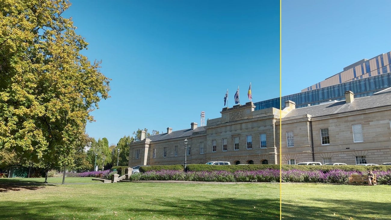
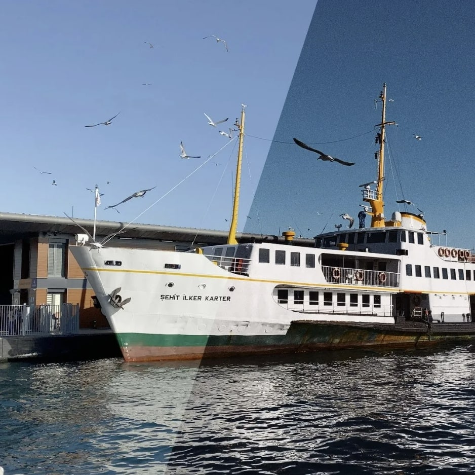
The color match feature in Wondershare Filmora Video Editor allows you to match one scene’s color in the video with all other different colors. The same video can have different results due to lighting concerns. For example, a car speeding up the road might display varied colors to the hype of the audience. The color match can correct the color combinations of all the clips with one click and introduce a beautiful consistency.
Color Match assists you to color correct clips as a batch instead of having to edit each individually. Here’s how.
For Win 7 or later (64-bit)
For macOS 10.12 or later
● Step 1: Import the media
Place the images and video clips you want to use into the timeline. If you wish to do any custom color correction, choose one clip or photo and proceed with making your changes.

● Step 2: Select Color Match
Then, place the playhead to a frame you wish to match your other clips. Choose the rest of the clips and photos and then either right-click and select ‘Color Match’ or hit the color icon on the toolbar and choose ‘Color Match.’

● Step 3: Start Color Matching
Then, choose a frame as a reference page and ‘Match.’

This is what you will watch after tapping the ‘Match’ option.

● Step 4: Preview your Color Match
Lastly, you need to modify the degree to which the color settings of the other clips are synced using the slider and preview the results in the Preview’s ‘comparison view.’

● Key Takeaways from This Episode →
● The connection of matching color combinations with emotion is unforgettable. Color brings that extra oomph to create stunning masterpieces. The lists of colors that match together are here to ensure we look through the perfect color to improve brand visibility or attract an audience.
● With these clues, you can get your hands on any and every color imaginable. You can use the matching color combinations by looking them through either the RGB or HEX color picker, whatever goes with your project at hand.
● Even Filmora is here to assist you in making beautiful videos by using the latest feature of color match. Now that you know how significant color is go on and find the perfect shade from our devised list of?colors that goes together.
Color is abundant in our life. Our moods, sensations, and perceptions, as well as our decision-making processes, are all influenced by color. Emotion evokes by color. It affects our perception, eliciting subconscious or conscious responses in the human brain. Color is perhaps the most robust tool at your disposal as a designer because of its influential and communicative nature.
Although not everyone is born with a keen sense of color or a natural aptitude for graphic design, there are methods and principles you can employ to select the best color that matches together to make a strong impression and achieve your desired effect. Fortunately, we’ve got you backed up. The ten best colors that match everything are listed below to help you create your next design.
In this article
01 [What is a color combination?](#Part 1)
02 [Types of color combinations](#Part 2)
03 [Two-color combination vs. Three-color logo combinations](#Part 3)
04 [How to apply color combinations to your designs?](#Part 4)
Part 1 What is Color Combination?
Color Theory is an art when it comes to playing with colors. It explains how people perceive color and the visual effects of colors mixing, pairing, and contrasting with one another. Designers use a color wheel and considerable collected knowledge about human psychology, society, and more to pick the perfect colors that match everything. Color is a crucial, if not the most important, feature of design since it may affect the meaning of the text, how people move across a layout, and how they feel. You may be more intentional in generating graphics that affect you if you understand color theory.
Part 2 Types of Color Combinations
Learning how different colors match together is essential for successful color combinations. Studying the color wheel and color harmonies (what works, what doesn’t, and how color communicates) will help you blend colors, establish a stronger brand, and share more effectively with your designers and printers.
The color wheel contains:?
● Three primary colors (red, yellow, and blue),?
● Three secondary colors (purple, green, and orange), and?
● Six tertiary colors (colors generated when you mix primary colors), plus (colors created from primary and secondary colors, such as blue-green or red-violet).
Draw a line over the core of the wheel to separate the warm colors (reds, oranges, and yellows) from the cool colors (blues, greens, and purples) (blues, greens, purples).
Warm colors are connected with activity, brightness, and vigor, whereas cold colors are associated with tranquility, peace, and serenity. So when you hold that color has a temperature, you can see how its use might influence your message.
On the color wheel, complementary hues are opposites. They may make artwork jump because of the great contrast between the two hues, but overusing them can get tiring.
Analogous hues are next to each other. Therefore, one color will dominate, one will support, and another will accent when developing a similar color scheme.
Triadic hues are energetic and vibrant, evenly dispersed throughout the color wheel. They provide visual contrast and harmony, allowing everything to shine as the overall image comes to life.
You can build a variety of grand color schemes by using the color wheel. Finding the perfect color combination for the right occasion is vital.
● 10 Matching Color Combination That Works Together
01Yellow and Blue
Yellow is the ultimate attention-getter, and it provides a young backdrop for the commanding navy. The equally electrifying Blue color that matches with Yellow dazzles the senses. It’s one of those color schemes mainly used for parties and casual gatherings. It helps instill a sense of purpose and energy in a design by contributing to enthusiasm.
02Black and Orange
The vibrant orange contrasts wonderfully with the dark black, providing a sense of mystery and suspense. Black is one of my favorite colors that match with orange.
03Lime Green and Purple
This high-octane color combination exudes a powerful presence, with purple being a beautiful choice to compliment light green. That?**color matches the lime green?**and presents a strong sense of design.?
04Dark Brown and Yellow
This fantastic color combination is ideal for creating a design that shouts spontaneity and dependability. The perfect tag-team, marigold yellow, catches the eye while dark brown keeps it. Yellow is yet another favorite pick of color that matches dark brown.
05Lavender and Indigo
Indigo, a dramatic color associated with the arts, is intuitive and forceful. It creates an exciting backdrop for the softer purple shade.
06Turquoise Blue and Purple
The imaginative purple and waterleaf turquoise combination create an overall sensation of limitless possibilities. These colors are ideal for communication-related businesses, such as teachers, trainers, and media communication. Purple is the choice of many designers, and this color matches turquoise blue perfectly.
07Light Pink, Hot Pink & Maroon
The pink color family is your best pick if you’re looking for a design that shouts “approachable.” These colors are distinct enough to provide visual interest to the design while remaining similar sufficient to maintain an innocent appearance. When you add maroon to the mix, you reduce the chance of appearing foolish while also exuding just the appropriate amount of professionalism. Hot Pink and Maroon are my top picks for a color that matches light pink.
08Light Gray and Desert Sand Beige
Although desert sand beige is one of the least-used design colors, it will make you stand out if you use it. For fashion or interior design brands, the tones of desert sand and emperor gray work nicely together.
09Dark Sea Green and Deep Forest Green
Forest green is a color that conjures up images of nature just by its name. This adaptable color connects with growth, and it looks cool and fresh when coupled with lighter seafoam green.
10Dark Blue, Turquoise, Beige
These colors go well together and reinforce the brand’s reliability. When you combine them with the beige backdrop, you feel secure exploring and pursuing. This color combination functions well for vacation, life consulting, and healthcare businesses.
Part 3 Two Color Combination vs. Three Color Combination
The choice is yours to decide. Colors have a significant role in your brand’s identification. After you’ve decided on the style of logo you want to employ, think about what each color will say about your business. Check for the feelings you want to evoke and how you want your customers to react to your brand. You can assist your brand leave a lasting impression and forming a stronger connection with your audience by selecting the proper color combination.
Part 4 How to Apply Color Combinations to Your Designs?
Specific color combinations have the power to catch our attention, generate emotion, and ultimately make a lasting statement.
In this section, we’ll look at some great colors that match together and can help your brand make a significant impact, along with a step guide on how you can easily color match during video editing.
0110 Beautiful Color Combinations for Your Next Design
● You can produce all kinds of grand color schemes with the color wheel. Find the right color pairing for the right occasion.
● Yellow, magenta, cyan, and black
Hex code: #e2d810, #d9138a, #12a4d9 and #322e2f
Almost each print project is dependent upon these four ink colors. They can create any color imaginable after they combine. Individually, they make a color scheme that’s bright, contemporary, and full of life.
● Shades of pink and brown
Hex code: #e75874, #be1558, #fbcbc9 and #322514
Pink is youthful, modern, and luxurious, and using different shades adds even more motion and depth to the design. Combining pink with dark brown adds a basic level of contrast and seriousness.
● Gold, charcoal, and grey
Hex code: #ef9d10f, #3b4d61 and #6b7b8c
It is a perfect merge of seriousness and sunshine. The gold represents nature and cheerfulness, which combines perfectly with two different shades of black and grey that add a layer of maturity.
● Tan, deep turquoise, and black
Hex code: #ecc19c, #1e847f, #000000
Over a natural, masculine tan base, this merge presents turquoise to the forefront to display its utility as a color that displays nature and rebirth.
● Raspberry and shades of blue
Hex code: #8a307f, #79a7d3, #6883bc
Like the palette above, trusted blue forms the foundation of this combination, while the pinkish-purple addition of raspberry adds luxurious femininity.
● Sea-foam, salmon, and navy
Hex code: #aed6dc, #ff9a8d, #4a536b
The ideal beachy palette. This unique pastel combination of salmon, sea-foam, and navy represents everyone’s favorite coastal colors and shows the warmth and peacefulness that comes from a day at the ocean.
● Yellow-green, olive, and forest green
Hex code: #e1dd72, #a8c66c, #1b6535
These three color combinations of green are the perfect palette for this lime and mint beverage. They both combine into a brilliant blend of excitement and youthfulness.
● Beige, slate, and khaki
Hex code: #f6ead4, #a2a595, #b4a284
Two complementary shades of lean brown masculine. An accent of khaki-grey represents a touch of elegance and maturity.
● Scarlet, light olive, and light teal
Hex code: #b85042, #e7e8d1, #a7beae
An extremely subdued take on the primary colors, this combination adds a lot of greys to keep the palette’s personality feeling severe and mysterious.
● Turquoise, mustard, and black
Hex code: #7fc3c0, #cfb845, #141414
This classic pairing of a calm and warm tone evokes calmness and cheerfulness. The black adds a bold, contemporary accent.
02How to Apply Color Combinations to Your Designs
The very famous video editor, Wondershare Filmora 11, is now launched. It is exclusively made with an intuitive interface now offering advanced editing features to even novice editors. The latest updates include audio ducking, motion graphics, keyframing, and color matches.
The color match feature in Wondershare Filmora Video Editor allows you to match one scene’s color in the video with all other different colors. The same video can have different results due to lighting concerns. For example, a car speeding up the road might display varied colors to the hype of the audience. The color match can correct the color combinations of all the clips with one click and introduce a beautiful consistency.
Color Match assists you to color correct clips as a batch instead of having to edit each individually. Here’s how.
For Win 7 or later (64-bit)
For macOS 10.12 or later
● Step 1: Import the media
Place the images and video clips you want to use into the timeline. If you wish to do any custom color correction, choose one clip or photo and proceed with making your changes.
● Step 2: Select Color Match
Then, place the playhead to a frame you wish to match your other clips. Choose the rest of the clips and photos and then either right-click and select ‘Color Match’ or hit the color icon on the toolbar and choose ‘Color Match.’
● Step 3: Start Color Matching
Then, choose a frame as a reference page and ‘Match.’
This is what you will watch after tapping the ‘Match’ option.
● Step 4: Preview your Color Match
Lastly, you need to modify the degree to which the color settings of the other clips are synced using the slider and preview the results in the Preview’s ‘comparison view.’
● Key Takeaways from This Episode →
● The connection of matching color combinations with emotion is unforgettable. Color brings that extra oomph to create stunning masterpieces. The lists of colors that match together are here to ensure we look through the perfect color to improve brand visibility or attract an audience.
● With these clues, you can get your hands on any and every color imaginable. You can use the matching color combinations by looking them through either the RGB or HEX color picker, whatever goes with your project at hand.
● Even Filmora is here to assist you in making beautiful videos by using the latest feature of color match. Now that you know how significant color is go on and find the perfect shade from our devised list of?colors that goes together.
Also read:
- How to Create Custom Lower Thirds in Filmora for 2024
- 2024 Approved A Detailed Guide to Do Color Correction in OBS
- Updated Turn Your Text Into a Podcast Made Possible for 2024
- New 2024 Approved Create Amazing Slow-Motion Videos 8 Affordable Slow-Motion Cameras
- 2024 Approved Rotate Video in iMovie
- New 2024 Approved Mask Tracking Is Believed to Be a Helpful Procedure for Marking Proper Areas in Videos. Learn How to Perform Premiere Pro Mask Tracking in This Guide
- Updated In This Article, We Are Going to Learn the Simplest Procedure on How to Cut And/Or Trim Videos Using VLC Media Player. Each Step Is Carefully Explained, with Screenshots Attached
- New How to Choose A Nice GoPro for Vlogging for 2024
- Updated How to Add Effects on TikTok
- Updated How to DIY VHS Overlay in After Effects?
- New Complete Guide to Make a Super Easy Rotating Video Effect for 2024
- Offering The Best Understanding of Performing iMovie Slow Motion Video
- Learn How to Change Aspect Ratio in iMovie on Mac, iPad, and iPhone in This Guide. And You Can Also Use iMovie Alternatives Like Wondershare Filmora to Edit Your Videos for 2024
- Updated Top 20 Best Text To Speech Software Windows, Mac, Android, iPhone & Online
- 2024 Approved A Guide to Adding Audio in Wondershare Filmora
- Updated 2024 Approved Would You Like to Know How to Change the Ratio of the Video or Which Is the Correct Aspect Ratio for Uploading to the Online Platform? Then, Go Through the Article to Get Complete Details About the Video Aspect Ratio
- In 2024, Get Creative with These 10 Video Editing App With Templates
- Updated 2024 Approved Merge MP4 Online? Its Easy With These 5 Tools
- New How to DIY VHS Overlay in After Effects?
- New In 2024, If You Are Looking for Reliable Solutions to Export Your Musical Slideshow Through a DVD Burning Process, Take a Breath, You Have Landed at the Right Place
- Updated 2024 Approved Replacing Sky in Your Pictures Using Online and Offline Tools
- New How to Remove or Mute Audio in Video with Android Phones?
- In 2024, Perfect Guide for Beginners to Make a TikTok with Multiple Clips
- New Learn the Step-by-Step Process of Slowing Down Time-Lapse Videos on Your iPhone
- New Color Matching Is the Trickiest Part of Graphic Designing. Learn in Detail About Using Canva Color Match Ideally While Working on Your Pins, Social Media Posts, and Other Designs for 2024
- Updated Converting an SRT (SRT/Sorted Reader) Into a DOCX File Is a Process. Here We Will Discuss Converting a Set File to a Docx File and More Details About This
- Updated 2024 Approved How to Take Slow Motion Videos
- Updated 2024 Approved How to Use Motion Tracking in Video Editing
- Updated 2024 Approved Practical Way to Resize Video in Handbrake
- New 2024 Approved How to Use Twixtor Effect to Add Slow-Motion Effect to Video?
- Updated 2024 Approved 2 Methods to Crop a Video in VLC
- Updated Practical Ways to Resize Video in Handbrake
- In 2024, This Article Talks in Detail About How to Export iMovie Video From iPhone, Mac, Etc. It Also Covers the Process of Using iMovie Alternative to Edit Videos on Mac. Check Out Now
- 2024 Approved A Comprehensive Guide on VHS Technology and Its Influence on Video Editing
- New Mix and Match The Ultimate List of 8 Video and Photo Merging Tools for 2024
- Updated How to Find Free Online Slideshow Maker with No Watermark for 2024
- Updated Bandicut Video Editor Download and Review for 2024
- Updated 2024 Approved Using Track Matte and Tracking in Adobe After Effects Reviewing All Possibilities
- Updated Split a Video in the Lightworks Step by Step for 2024
- Updated Best 15 Instant Classics Animated Cartoon Movies for 2024
- Ultimate Guide from Nokia C210 FRP Bypass
- How to Come up With the Best Pokemon Team On Motorola Moto G14? | Dr.fone
- Universal Unlock Pattern for Samsung Galaxy F34 5G
- Fix Cant Take Screenshot Due to Security Policy on Realme 12+ 5G | Dr.fone
- Best 10 Mock Location Apps Worth Trying On Tecno Camon 30 Pro 5G | Dr.fone
- How to unlock a disable iPhone 8 without icloud
- How Do You Remove Restricted Mode on iPhone 7 Plus | Dr.fone
- In 2024, 4 Ways to Transfer Music from Vivo Y78 5G to iPhone | Dr.fone
- In 2024, Best Poco F5 5G Pattern Lock Removal Tools Remove Android Pattern Lock Without Losing Data
- In 2024, How to fix iCloud lock on your Apple iPhone 14 Pro Max and iPad
- Title: Updated 6 Ways to Mimic Professional Filming Gears for 2024
- Author: Morgan
- Created at : 2024-05-19 05:12:52
- Updated at : 2024-05-20 05:12:52
- Link: https://ai-video-editing.techidaily.com/updated-6-ways-to-mimic-professional-filming-gears-for-2024/
- License: This work is licensed under CC BY-NC-SA 4.0.
